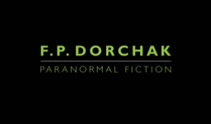
Well. Susie posted that she got new plates, so I’m posting that I’m getting new business cards!
Lon Kirschner designed them and this actually came from a section of my bookmarks that he also designed. I love the solid black, which is like the unknown, or “like a mysterious void,” a friend said. So now I got a “brand” goin’ on. I like it.

Love the “paranormal green,” I’m calling it, on the back of the card. Love the overall simplicity of design. The minimalist design. The front will be laminated and the back will not be, so it can be written upon.

I’ve been needing to create an updated card I can give to everyone, one with my correct [public] e-mail address, so I can stop crossing out the old one on the old cards I’ve been using. I’m also getting ready to take some new head shots and such, through my friend Jan C. J. Jones. While I still look quite like my basic head shot-by-the-pine, and my sailing shot, et cetera, I do have just a touch more gray in there! So…
I’m trying to give things a face-lift of sorts.
I will be attending the Denver Comic Con (DCC) June 18th (for a book signing) and 19th, for two panels:
- Dealing with Discouragement in Writing & Publishing, June 19, 12:15 – 1:05 MT
- Why We Write Short Fiction, June 19, 2:15 – 3:05 MT
This will be my first DCC attendance, and I’m looking forward to it!
Lon Kirschner may be contacted at:
Phone: 518/392-3823
E-mail: info@kirschnercaroff.com
Book Cover Site: http://www.lonkirschner.com/
Related Articles:
- Kirschner Cover Art: “Clowns,” by F. P. Dorchak (fpdorchak.wordpress.com)
- Kirschner Cover Art: In Pinelight, by Thomas Rayfiel (fpdorchak.wordpress.com)
- Kirschner Cover Art: Grace, by Howard Owen (fpdorchak.wordpress.com)
- Cover Artist Lon Kirschner Interview (fpdorchak.wordpress.com)
Love your card!
Congrats on presenting at Comic Con! I LOVED it last year. I wrote about it and posted pictures on my blog. I don’t think I’ll be able to go this year, but my daughter already has her ticket! She was Bat Girl (spitting image of Alicia Silverstone), I was Poison Ivy, and Danny was a fantastic Penguin. We had a blast.
Thanks, Susie! your post sounds familiar…I’ll have to check it out [again?]….
And thanks for inspiring me to post about my cards! :-]
Nice. Being able to write on it is important. When I’m handed someone’s card I always take the time later to write down a reminder on it..like woman in tutu who said she’d be happy to give me Bolshoi ballet inside scoop. Otherwise later I can’t connect card to face.
Thanks! And indeed! I had some where they’d been laminated on both sides. That had been a mistake…. :-
I like it! A simple design that’s very effective, and the ectoplasmic green is ideal. 🙂
Thanks, Paul! And they just arrived yesterday–lookin’ quite slick! I like the change!
You know, Frank, normally I’m not a less-is-more kinda gal. But your new card design proves that sometimes less is exactly what you need. Clean, sharp, and professional, with a nice touch of mystery and style. That limey green is one of my favourite colours and it looks so nice on the black. Ha, at a quick glance, the design immediately made me think it said “Paranormal Investigator”, and considering the types of stories you like to write, what could be more appropriate? ;D
Thanks, Wendy! That’s exactly what I was shooting for! I love your description: “a nice touch of mystery and style.” :-]
And, I guess in some fashion, yes, I am a “paranormal investigator! How funny! That is totally appropriate!
Thanks for stopping by!