I just discovered that I have a new “Clowns” review on Amazon.com! Thank you so much, Queen Farm Chick!
Speculative Fiction Author
by fpdorchak

I just discovered that I have a new “Clowns” review on Amazon.com! Thank you so much, Queen Farm Chick!
by fpdorchak

I have 19 slightly damaged copies of Voice that I want to give away!
Their damages?
The inside graphic image of the front cover is grainy. That’s it. Nothing else is damaged in the book—well, if you don’t count my intense, troubled characters. So, this being the case, I want to give them out for free for reviews. I’ll also pay for shipping.
I’ll even autograph them for ya.
So, where’s the risk?
You can contact me at the following, but these are hardcopy trades, so I will need a name and address:
So, there’s no risk! You not paying for the book, you’re not paying for the shipping, and if you don’t like it, you don’t have to keep reading! But I’m hoping you will like some aspect of this intense, emotionally thrilling story and will write up a review on your favorite site as well as on Amazon.com. If you’re not interested, please pass this around to another who might be interested, and as long as I have copies, I’ll send them out.
I also plan on doing the same with some advanced review copies for my short story collection, Do The Dead Dream?, coming out this Hallowe’en, so stay tuned!
I thank you all in advance for your time!
Related Articles
by fpdorchak

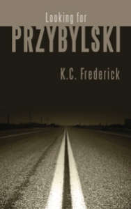
In looking for the next of Lon Kirschner’s cover art I wanted to review, I came upon one I’d been looking at for a while: Looking For Przybylski, by K.C. Frederick. Now, I don’t read all these books as I review their cover art…I just don’t have that kind of time, right now…so I look at the cover art in-and-of themselves. How the covers affect me. How Lon’s work “hits” me. Sometimes I’ll look at reviews, and once, like with A Long Cold Fall, by Sam Reaves, I even got to interview the author (thanks, Lon, for putting us in touch!). On this shot, I looked at some of the reviews. One review in particular talked about the “…difficulty of writing about race with moral integrity.” There were one or more references in the review of the book dealing with or not properly dealing with being a “goddamn Detroit Polack” (the reviewer, oddly enough, was also a “Przybylski,” J.J. Przybylski). This reminded me of when I was growing up and “used to be Polack.”
All through my formative years I’d thought—well, our family thought—that my mom’s side had Polish in the bloodline. So I’d valiantly defended all the Polack jokes. But after graduating high school we’d all come to find out that that line of her family we’d thought had been Polish…had actually been Austrian.
Sonofa….
Really, Mom? You couldn’t have done a little research a few years earlier?
Sigh.
If I remember all that had been discovered right, the family-member-in-question had been Austrian during WWII and had fled Austria on the basis of claiming to have been Polish to avoid being drafted into the Austrian army…hence, the lineage fabrication.
What does this have to do with the book?
Well, apparently nothing…except that J.J. Przybylski’s review reminded me of the whole “Polack thing” of my youth, and, well, apparently, this book deals-or-not-properly-deals-with that “whole Polack thing.”
Back to the cover: I picked this cover this time around because I love road trips and being on the road, and well, that is what this cover is all about!
It’s portraying a road trip into the night. And what does the night typically symbolize? Mystery. The unknown. “Darkness” of some kind beyond the obvious. But there is a light being shone (“shined”? “Shone” works for what’s coming next…) into that darkness, as is (pardon the pun) shown at the bottom of the cover. And that is what this book seems to be about: Przybylski is an undertaker who has taken down a one-time Detroit criminal, named Ziggy Czarnecki. Ziggy hears about Przybylski and goes in search of him cross-country. On a bus. Weird things happen. Interesting people are met. And according to J. J. Przybylski’s review, “It’s a good book…written with a gentleman’s reserve.” Now, if something supernatural was involved, I be tempted to take a read….
I also love the artistic perspective of the road, vanishing not only into the distance, but also into the night. And sometimes…sometimes I feel it’s better to leave such musings there…and not actually discover what is actually found there…in the night…in the “vanishing point” that is at the end of that road, this novel. I’m sure given the plot and characters, nasty things will happen, and I don’t necessarily want to know those nasty things. But I like the mystery that this cover implies. Love the imagery.
Here is what Lon Kirschner has to say about his work in designing this cover:
“When I first received the manuscript I remember thinking, Hmmm…I can’t even pronounce the title of this book. That led me to thinking that it should somehow become part of the cover in a very clean way. For the uninitiated in Polish names, I kept the typography simple and pretty straight forward with a color that evokes the flecks in the road.
“Yes, this is a road trip and it does take the form of a bus ride through lonely country. I remembered long bus trips when I was a teenager in upstate NY going to visit my sister at college and a certain sadness I felt traveling home alone on the bus at night when the weekend visit was over. It was that feeling of riding a bus alone that inspired this. The trip in the book is odd as bus trips often are when you are closed in with people you don’t know but somehow manage to form some kind of bond with the person next to you. Things seem accelerated in the small amount of time you get to know (or choose not to know) your fellow travelers.
“You are right, this book does have a supernatural quality to it, but nothing terrible happens. In fact you actually don’t know if something does happen out of the ordinary, because it is the ordinary that somehow becomes extraordinary.
“The cover does represent the bus trip in a literal sense, but more importantly it represents someone getting closer to a knowledge about themselves that they never would have discovered had they not gotten on the bus and made the journey.”
Thanks, Lon. I also used to ride buses during my teenaged years. My parents had divorced and I had taken the Trailways line down from Saranac Lake, NY to Glens Falls and Albany to visit my mother. As Lon says, I also felt “a certain sadness” upon my return trip from seeing my mom. I found the Trailways trips cozy. I don’t recall if I traveled alone or with my brother, Chris (my other two siblings stayed with my mom), but since those bus rides involved a bit of distance, buses stop every few miles, the night was always involved. And, as I’ve already mentioned, I love driving, being on the road, and night drives…so I liked the nocturnal atmosphere of the drives, and being in a big comfy bus. I don’t recall too much interaction on these bus rides. Just lots of pleasant smiles and politeness…and intense reflection about how our family had fractured and life would never be the same.
Perhaps not too far from how this story unfolds….
Lon Kirschner may be contacted at:
Phone: 518/392-3823
E-mail: info@kirschnercaroff.com
Book Cover Site: http://www.lonkirschner.com/
Related Articles:
by fpdorchak

Lon contacted me about a guy named Sam Reaves. From his website, Sam was raised in small Midwestern towns but has lived in or around Chicago for most of his life. He’s also lived or made extended journeys in Europe, Latin America, and the Middle East…and fluently speaks five languages. This is something I wished I could do (I barely remember my French and German!). He’s worked as a translator and a teacher, been president of the Midwest Chapter of the Mystery Writers of America, and has published ten novels, seven as Sam Reaves and three as Dominic Martell. He currently resides in Evanston, Illinois. His work has been traditionally published, but he’s re-releasing some of it through Amazon.
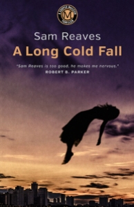
Lon sent me some cover art he did for Sam, and one of them really grabbed me: A Long Cold Fall. I love “dark” and “weird” and I love that body position of the girl! And to be placed in that particular position…well, something isn’t right. In fact…something is far from right…there is weirdness afoot…and I am a fan of weirdness! And it’s placed high into the air. Add to that the title. The word “fall” is in there, and while the body is falling…its position is so…peculiar…so high above the ground. Is she falling? Is she suspended?
I contacted Lon about this cover, and this is what he had to say:
“Sam was referred to me through the mystery writer Chris Knopf. We decided to do one book first to see how it goes. He was taking an older print series and translating them to e-books. A Long Cold Fall was the first. The title is a play on a suicide and the time of season the action happens. After we completed it, he decided he wanted to release all the books in the series at the same time.
“A Long Cold Fall is the most ethereal cover. The book opens with a suicide jump. I did several versions and Sam liked the version we now have.
“There were some comments from friends about the body position, so we went back and forth with the angle. I tilted it back slightly, it gave it an odd feeling of falling but also floating, which upped the creep factor. Using the Chicago skyline in the background but not really indicating a place from where the fall begins creates visual confusion. Is she falling or flying? I always thought about it as the classic line ‘I saw my whole life flash in front of me.’ It is a sense of stop action, the moment in the descent when everything slows down right before the final crash. There is a certain beauty in that moment. We know what will happen, but everything seems so calm.
“It is interesting to note that since all of these books (four total) focus around the same character who, while not a professional detective, always seems to find himself in the middle of these mysteries, made me feel I needed to create some type of identifier that ties them together as a series. I developed a circular monogram that is in the same position on each book and picks up the color theme of the cover. A simple device that instantly lets a potential reader know that this is a Cooper MacLeish Thriller.
“Sam was great to work with. He had definite ideas, but basically let me go my own way.
“I think on all levels, the results were very positive. Another positive was I read all the books and enjoyed every one which made my job that much easier.”
Thanks, Lon, for your insight!
Well, then Lon put me in contact with Sam, so I asked him some questions, and here is what Sam had to say:
Sam…your thoughts on cover art?
“Get a professional. That’s what everyone told me. Don’t try and do it yourself. You need a good professionally done cover to sell an e-book.
“I had actually done it myself (with some help from my graphically gifted wife) for a previous novel I’d published through Smashwords, and I thought it hadn’t come out too badly. But by the time I had gotten back the rights to my first four novels, a series originally published by Putnam in the early nineties, and was ready to put them up as e-books, I had decided that professional covers were probably a pretty good investment. You gotta spend money to make money, they say. So I went looking for covers I liked.”
And?
“I looked at a lot of covers. Some were brilliant and attention-grabbing; some were hideous. And yeah, the amateur ones didn’t make me want to click on Buy. The majority were just, well, ordinary. I wanted something that held my eye for more than a second or two.
“And here they were: a series of covers done for my friend Chris Knopf the crime writer. Slick, original images, colorful and dramatic. I e-mailed Chris: Who does your covers? Chris got back to me right away with Lon Kirschner’s name, adding that Lon was terrific to work with; he would actually read the books and custom-tailor an approach. It sounded like I couldn’t do any better than that.”
Have you ever worked with a cover artist before?
“I had never worked with an artist before; in my experience publishers just sent the author a proof as a fait accompli. I never felt I had enough clout to question it. I contacted Lon and sent him the first book in the series, my debut novel from 1991, A Long Cold Fall. The title is a pun on the season of the year and the method chosen in the apparent suicide of a woman who opens the book.”
Had you any specifics you did or didn’t want to see in your cover?
“The only definite idea I remember expressing to Lon was that I didn’t want a cover with another generic shot of the Chicago skyline. The first image he sent back was striking, the body of a woman in midair, silhouetted against a twilit sky. I loved it; my only reservation was that as depicted, more or less upright with arms spread, she looked more as if she were being borne up to heaven than as if she were falling. I asked Lon if he could make it unmistakable that she was falling. He said sure.
“The result was the dramatic image that now grabs prospective readers of A Long Cold Fall. I think it’s a great cover that captures the key image of the book.”
What did you like the most in working with Lon on this—or any other cover?
“Working with a professional who clearly took an interest in the book and made a real effort to come up with an image that fit the story made the experience a pleasure. Lon has now done covers for all four of my Cooper MacLeish novels, and they will be out there grabbing readers, I hope, for years to come.”
Thank you both for your time and effort, Lon and Sam! It’s been a pleasure!
*******************************************
Sam Reeves
Website: http://www.samreaves.com/
Lon Kirschner may be contacted at:
Phone: 518/392-3823
E-mail: info@kirschnercaroff.com
Book Cover Site: http://www.lonkirschner.com/
Related Articles:
by fpdorchak

Well. Susie posted that she got new plates, so I’m posting that I’m getting new business cards!
Lon Kirschner designed them and this actually came from a section of my bookmarks that he also designed. I love the solid black, which is like the unknown, or “like a mysterious void,” a friend said. So now I got a “brand” goin’ on. I like it.

Love the “paranormal green,” I’m calling it, on the back of the card. Love the overall simplicity of design. The minimalist design. The front will be laminated and the back will not be, so it can be written upon.

I’ve been needing to create an updated card I can give to everyone, one with my correct [public] e-mail address, so I can stop crossing out the old one on the old cards I’ve been using. I’m also getting ready to take some new head shots and such, through my friend Jan C. J. Jones. While I still look quite like my basic head shot-by-the-pine, and my sailing shot, et cetera, I do have just a touch more gray in there! So…
I’m trying to give things a face-lift of sorts.
I will be attending the Denver Comic Con (DCC) June 18th (for a book signing) and 19th, for two panels:
This will be my first DCC attendance, and I’m looking forward to it!
Lon Kirschner may be contacted at:
Phone: 518/392-3823
E-mail: info@kirschnercaroff.com
Book Cover Site: http://www.lonkirschner.com/
Related Articles:
by fpdorchak

Okay. Yes. I know…shameless, shameless self-promotion!
But I’ve wanted to talk about this cover since I first laid eyes on it…or it had laid eyes on me….
As I’d previously mentioned, I’d been (and still am) messing around with short stories, and had come across this one and decided to published it as its own stand-alone story. So, I turned to Lon Kirschner, who’d done a couple of my other covers. As always, Lon turned out a fantastic cover! It even reminded me of The Grievers, the cover he’d done for Marc Schuster, back in 2012 (and also involving clowns, by the way).
So, of course I want to talk about it!
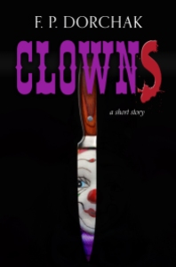
When I first opened the file and looked at it, the very first thing I saw was the clown’s face…and I thought, ewwww…how frigging creepy! But…why is it starting at me through a slit?…a narrow opening…a…waaait a minuuute—
BOOM!
It hit me, just like that—the clown was staring at me from the blade of a knife!
I bust out laughing.
How frigging perfect!
I was walking around the house with my tablet looking at this thing and laughing my ass off. I just couldn’t take my eyes off it! What a perfect cover for my short-short story! The creepy clown face, the purple from its little clown-doll outfit, the kitchen knife, the script of the title—including the red “S”—all on a black background, which to me symbolizes the night/unknown! It was such a clean, subtle, no-nonsense creepy (have I mentioned this?!) cover!
I mean, our clown…the silly little dresser-top doll…the subtle way it’s peering out at us from the shiny knife blade is just like how I believe these little bastards are peering out at us from our dresser tops! Oh-so slyly…are they…or are they just staring ahead with their lifeless, beady little eyes?
Of course they’re staring at us!
This is what Lon had to say about creating my “Clowns” cover—which, by the way, was the first time he’d ever created a cover for a short story—I think you’ll really get a kick out of this:
“It did creep me out. I don’t really mind real clowns (although they are a little odd) but clown dolls are what I really find creepy. I also find some other types of dolls creepy but that might be just me. When we were kids we had a set of Raggedy Ann and Andy dolls that my Aunt sent from her travels in Europe. They sat on the old radiator that was in the bedroom I shared with my sister when we were very young. I would wake up some times in the middle of the night and I would see them staring at me. Like your story. I still think they moved.
“The other issue with this cover was I knew you had high expectations for this and I felt a little under pressure to produce something that hinted at the story but didn’t give it all away.
“I wanted it very, very simple but have that disturbing feeling. I went back and forth with the alternate “S” in ‘Clowns.’ At first I thought it was a bit cliché, but then I thought it was a good way to bring in that murderous element without being overly gruesome and it did offset that typical circus lettering.
“My own clown issues and creating a successful piece all combined to create something a little difficult to work on, but in reality, once I got going it all fell into place rather quickly.
“I always start with some sort of rough idea. I knew I didn’t want to see the whole clown face and I knew I needed a knife, I just wasn’t exactly sure how they would all meld together.
“This is how I have always worked. Some people sketch it all out exactly but that never worked for me. I do make little sketches on Post-it notes to sort some things out, but that is usually as far as I go. I find the fun in moving things around and making my adjustments on the fly. I think I moved the image of the knife over at one point about a sixteenth of an inch. Then I was satisfied!”
I love this line: “I still think they moved“!
I also like how Lon didn’t want to “give it all away,” which I could see might be a little difficult to do in a quick short short story of less than 800 (713) words! But, he did it, I’m proud of him and his result, and I am still beside myself over the cover!
So…I hope you’ll excuse me for analyzing one of my own, but I’ve been wanting to talk about it since I got it. With my next Kirschner Cover Art post, I’ll go back to talking about other author covers….
But…for now…sleep with one eye open!
Do you know where your knives are?
*******************************************
Lon Kirschner may be contacted at:
Phone: 518/392-3823
E-mail: info@kirschnercaroff.com
Book Cover Site: http://www.lonkirschner.com/
Related Articles:
COSine 2024 – January 19 – 21, 2024
MileHiCon56 – October 25 – 27, 2024
COSine 2025 – January 24 -26, 2025