• Skip to main content
  • Skip to footer

F. P. Dorchak

Speculative Fiction (New Weird) Author

  • Home
  • Books
    • What Readers Are Saying
  • Short Stories
  • About
  • Blog
    • Runnin Off at the Mouth
    • Reality Check
  • Events
  • Contact

Book Covers

Kirschner Cover Art: A Long Cold Fall, by Sam Reaves

September 19, 2016 by fpdorchak

A Long Cold Fall, by Sam Reaves © 2016 (reissue).

Lon contacted me about a guy named Sam Reaves. From his website, Sam was raised in small Midwestern towns but has lived in or around Chicago for most of his life. He’s also lived or made extended journeys in Europe, Latin America, and the Middle East…and fluently speaks five languages. This is something I wished I could do (I barely remember my French and German!). He’s worked as a translator and a teacher, been president of the Midwest Chapter of the Mystery Writers of America, and has published ten novels, seven as Sam Reaves and three as Dominic Martell. He currently resides in Evanston, Illinois. His work has been traditionally published, but he’s re-releasing some of it through Amazon.

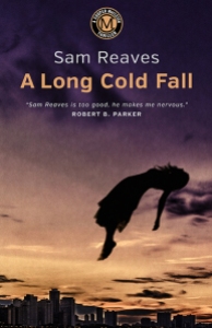
Lon sent me some cover art he did for Sam, and one of them really grabbed me: A Long Cold Fall. I love “dark” and “weird” and I love that body position of the girl! And to be placed in that particular position…well, something isn’t right. In fact…something is far from right…there is weirdness afoot…and I am a fan of  weirdness! And it’s placed high into the air. Add to that the title. The word “fall” is in there, and while the body is falling…its position is so…peculiar…so high above the ground. Is she falling? Is she suspended?

I contacted Lon about this cover, and this is what he had to say:

“Sam was referred to me through the mystery writer Chris Knopf. We decided to do one book first to see how it goes. He was taking an older print series and translating them to e-books. A Long Cold Fall was the first. The title is a play on a suicide and the time of season the action happens. After we completed it, he decided he wanted to release all the books in the series at the same time.

“A Long Cold Fall is the most ethereal cover. The book opens with a suicide jump. I did several versions and Sam liked the version we now have.

“There were some comments from friends about the body position, so we went back and forth with the angle. I tilted it back slightly, it gave it an odd feeling of falling but also floating, which upped the creep factor. Using the Chicago skyline in the background but not really indicating a place from where the fall begins creates visual confusion. Is she falling or flying? I always thought about it as the classic line ‘I saw my whole life flash in front of me.’ It is a sense of stop action, the moment in the descent when everything slows down right before the final crash. There is a certain beauty in that moment. We know what will happen, but everything seems so calm.

“It is interesting to note that since all of these books (four total) focus around the same character who, while not a professional detective, always seems to find himself in the middle of these mysteries, made me feel I needed to create some type of identifier that ties them together as a series. I developed a circular monogram that is in the same position on each book and picks up the color theme of the cover. A simple device that instantly lets a potential reader know that this is a Cooper MacLeish Thriller.

“Sam was great to work with. He had definite ideas, but basically let me go my own way.

“I think on all levels, the results were very positive. Another positive was I read all the books and enjoyed every one which made my job that much easier.”

Thanks, Lon, for your insight!

Well, then Lon put me in contact with Sam, so I asked him some questions, and here is what Sam had to say:

Sam…your thoughts on cover art?

“Get a professional. That’s what everyone told me. Don’t try and do it yourself. You need a good professionally done cover to sell an e-book.

“I had actually done it myself (with some help from my graphically gifted wife) for a previous novel I’d published through Smashwords, and I thought it hadn’t come out too badly. But by the time I had gotten back the rights to my first four novels, a series originally published by Putnam in the early nineties, and was ready to put them up as e-books, I had decided that professional covers were probably a pretty good investment. You gotta spend money to make money, they say. So I went looking for covers I liked.”

And?

“I looked at a lot of covers. Some were brilliant and attention-grabbing; some were hideous. And yeah, the amateur ones didn’t make me want to click on Buy. The majority were just, well, ordinary. I wanted something that held my eye for more than a second or two.

“And here they were: a series of covers done for my friend Chris Knopf the crime writer. Slick, original images, colorful and dramatic. I e-mailed Chris: Who does your covers? Chris got back to me right away with Lon Kirschner’s name, adding that Lon was terrific to work with; he would actually read the books and custom-tailor an approach. It sounded like I couldn’t do any better than that.”

Have you ever worked with a cover artist before?

“I had never worked with an artist before; in my experience publishers just sent the author a proof as a fait accompli. I never felt I had enough clout to question it. I contacted Lon and sent him the first book in the series, my debut novel from 1991, A Long Cold Fall. The title is a pun on the season of the year and the method chosen in the apparent suicide of a woman who opens the book.”

Had you any specifics you did or didn’t want to see in your cover?

“The only definite idea I remember expressing to Lon was that I didn’t want a cover with another generic shot of the Chicago skyline. The first image he sent back was striking, the body of a woman in midair, silhouetted against a twilit sky. I loved it; my only reservation was that as depicted, more or less upright with arms spread, she looked more as if she were being borne up to heaven than as if she were falling. I asked Lon if he could make it unmistakable that she was falling. He said sure.

“The result was the dramatic image that now grabs prospective readers of A Long Cold Fall. I think it’s a great cover that captures the key image of the book.”

What did you like the most in working with Lon on this—or any other cover?

“Working with a professional who clearly took an interest in the book and made a real effort to come up with an image that fit the story made the experience a pleasure. Lon has now done covers for all four of my Cooper MacLeish novels, and they will be out there grabbing readers, I hope, for years to come.”

Thank you both for your time and effort, Lon and Sam! It’s been a pleasure!


*******************************************

Sam Reeves

Website: http://www.samreaves.com/

Contact Sam

Lon Kirschner may be contacted at:

Phone: 518/392-3823

E-mail: info@kirschnercaroff.com

Book Cover Site: http://www.lonkirschner.com/

Related Articles:

  • Kirschner Cover Art: “Clowns,” by F. P. Dorchak (fpdorchak.wordpress.com)
  • Kirschner Cover Art: In Pinelight, by Thomas Rayfiel (fpdorchak.wordpress.com)
  • Kirschner Cover Art: Grace, by Howard Owen (fpdorchak.wordpress.com)
  • Cover Artist Lon Kirschner Interview (fpdorchak.wordpress.com)

Filed Under: Art, To Be Human, Writing Tagged With: A Long Cold Fall, Book Covers, Books, Cooper MacLeish, Dominic Martell, Lon Kirschner, Mysteries, Sam Reaves, Thrillers

Kirschner Cover Art: In Pinelight, by Thomas Rayfiel

January 18, 2016 by fpdorchak

In Pinelight, by Thomas Rayfiel, Triquarterly (Publisher), 2013

When I first saw this cover, I was stunned—stopped in my tracks, much like The Grievers.

I loved this cover!

Much like my discussion of Grace, this cover also brings me back to my life in the Adirondacks of upstate New York. The North Country. If you haven’t guessed it yet, I had a great upbringing. I loved where and when I grew up. Love the wild lands…the brooding mysteries of the dark waters and woods. I spent so much time roaming the woods on my own…hanging out at the lake across the road from our house. Soaking in this cover really brought it all back. Now, the story itself…it’s method of delivery…did not work for me. I wanted it to…because of the cover…because of the subject matter (an upstate NY town that was flooded out)…but simply couldn’t. It simply didn’t work for me.

But…back to the cover…I love the feeling of foreboding…the mystery…the darkness. I love the trees and all their shadows…how trees and shadows and mist-over-water lends toward an implied deep, dark mystery…implied goings-on that are hidden in either-or-both the water and the woods. Again, since I had not finished reading this novel, I can only guess…but it all implies some dark dealings going on in some dark woods…and/or water. Back country secrets….

I can feel the crisp coldness of the water…the resilient bounce of the humus-carpeted forest floor…inhale the heavy scent of the pines. Feel myself weaving in and out between the trees…moving deeper into the mystery forest and snapping off dead branches as I go. Holding the stiff, dead branches in my hands as I trek ever farther into the woods…listening to the distant woodpeckers and the wind….

Yet above it all is the sky with rising ground fog.

Whatever darkness lies below…there is “a light at the end of the tunnel”—or, in this case, “above the trees.”

But in the woods there be secrets.

“Book covers are visceral,” Lon says it best on his book-cover-dedicated website, lonkirschner.com. “A good cover grabs you in an unexpected way,” he goes on to say, and In Pinelight had done just that…much like Grace had also done for me. Some covers you “just like”…they’re eye candy, they’re cute, they’re whatever (in a good way)…and some just immediately get under your skin and into your marrow. And that’s what’s happened in In Pinelight. Lon’s work has a “heart” to it…and maybe it’s because he reads every manuscript for which he creates a cover. Maybe he’s just good.

No “maybe’s” about it!

So, yes, I think In Pinelight has become one of my favorite covers.

What went through Lon’s mind as he worked this cover?

Here are his words:

“Yes, you are correct. This was a difficult book to read because it uses no punctuation or paragraphs. It is the ramblings of a thought process put to words. As you know, I make a commitment to read every book so I can (hopefully) get it right. The author gave me a warning about the quirky style of this book so I was prepared. It was a slow start, you had to get into the rhythm of it. I found myself enjoying it because it was like I was uncovering a mystery. Sometimes you had no clear idea what was going on but then out of nowhere you made a connection. You are the listener to this man’s oral history of his life. It was a strange life with many twists and turns but the constant was the lake and the trees. You would feel their presence on almost every page, it was the natural way to go. The problem was to find an image that had the right sense of place and mystery. I came across an image that felt good but there were things that just were not right. Fortunately we are able to make corrections with the tools we have available to us. The shape of the tree line wasn’t quite right. There were a few disturbing branches and several tall trees sticking too far up above the rest. The trees had to look a little other worldly. This was fixed by pushing the color toward the almost unnatural green. The final element was to enhance the mist coming off the water. These were all relatively simple to do but combined to change a rather ordinary photo into the type of image that can stir up all sorts of emotions and memories as it did with you.

“The final element was the font choice for the title and author. I felt strongly that this had to be extremely simple so it would not compete with the image, the real star of the show. A clean sans serif font solved that problem.

“This publisher had requested to see several concepts. When I did this one I knew the job was done but did the others and submitted all together. To say I was not surprised when the Art Director emailed me with the news that this was the choice is an understatement. One, it made me feel like I really did know what I was doing and two, I knew the Art Director was smart!

“It is actually harder to do a book like this because it is really a mood piece. So much of the work I do is compositing and creating original art that piece together a book in a visual way. This type of cover is much more visceral and relies on pure emotion to get the concept across. Another interesting fact is that you were drawn to the book and wanted to read it but in the end, your enjoyment of it came from the cover and not the text.”

Ha—I like how Lon points out that my enjoyment of the book came from the cover and not the text! This is quite ironic for a writer, because so many authors complain about their covers because they feel the traditional publishing houses have “slapped on” some trite, awful cover to their manuscripts…covers (these authors lament) that have little to do with actual story…or are just plain heinous, with little thought or effort having gone into them….

Thank you, Lon, for your insight! Maybe some later day I’ll again attempt to complete reading this novel…and I’ll definitely check out his other, Time Among The Dead.

Thomas Rayfiel doesn’t appear to have his own website, but here’s his Amazon page.

*******************************************

Lon Kirschner may be contacted at:

Phone: 518/392-3823

E-mail: info@kirschnercaroff.com

Site: http://www.kirschnercaroff.com

Book Cover Site: http://www.lonkirschner.com/


Related Articles:

Kirschner Cover Art: Grace, by Howard Owen (fpdorchak.wordpress.com)

Cover Artist Lon Kirschner Interview (fpdorchak.wordpress.com)

Filed Under: Art, Books, Leisure, Writing Tagged With: Book Covers, Cover Art, Forest, In Pinelight, Lakes, Lon Kirschner, New York State, Publishing, Thomas Rayfiel, Trees, Waterfalls, Woods, writing

Footer

Upcoming Events

Events

Heading To

COSine 2026 – January 23 -25, 2026

Mountain of Authors – Unable to attend in 2026

MileHiCon58 – October 23 – 25, 2026


Follow Me

  • Facebook
  • Instagram
  • Pinterest
  • WordPress.org

Copyright © 2026 · Author Pro on Genesis Framework · Powered by WordPress.com. · Log in