• Skip to main content
  • Skip to footer

F. P. Dorchak

Speculative Fiction (New Weird) Author

  • Home
  • Books
    • What Readers Are Saying
  • Short Stories
  • About
  • Blog
    • Runnin Off at the Mouth
    • Reality Check
  • Events
  • Contact

Cover Art

Kirschner Cover Art: Looking For Przybylski, by K.C. Frederick

March 3, 2017 by fpdorchak

Looking For Przybylski, by K.C. Frederick, ©2012

In looking for the next of Lon Kirschner’s cover art I wanted to review, I came upon one I’d been looking at for a while: Looking For Przybylski, by K.C. Frederick. Now, I don’t read all these books as I review their cover art…I just don’t have that kind of time, right now…so I look at the cover art in-and-of themselves. How the covers affect me. How Lon’s work “hits” me. Sometimes I’ll look at reviews, and once, like with A Long Cold Fall, by Sam Reaves, I even got to interview the author (thanks, Lon, for putting us in touch!). On this shot, I looked at some of the reviews. One review in particular talked about the “…difficulty of writing about race with moral integrity.” There were one or more references in the review of the book dealing with or not properly dealing with being a “goddamn Detroit Polack” (the reviewer, oddly enough, was also a “Przybylski,” J.J. Przybylski). This reminded me of when I was growing up and “used to be Polack.”

All through my formative years I’d thought—well, our family thought—that my mom’s side had Polish in the bloodline. So I’d valiantly defended all the Polack jokes. But after graduating high school we’d all come to find out that that line of her family we’d thought had been Polish…had actually been Austrian.

Sonofa….

Really, Mom? You couldn’t have done a little research a few years earlier?

Sigh.

If I remember all that had been discovered right, the family-member-in-question had been Austrian during WWII and had fled Austria on the basis of claiming to have been Polish to avoid being drafted into the Austrian army…hence, the lineage fabrication.

What does this have to do with the book?

Well, apparently nothing…except that J.J. Przybylski’s review reminded me of the whole “Polack thing” of my youth, and, well, apparently, this book deals-or-not-properly-deals-with that “whole Polack thing.”

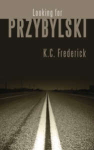
Back to the cover: I picked this cover this time around because I love road trips and being on the road, and well, that is what this cover is all about!

It’s portraying a road trip into the night. And what does the night typically symbolize? Mystery. The unknown. “Darkness” of some kind beyond the obvious. But there is a light being shone (“shined”? “Shone” works for what’s coming next…) into that darkness, as is (pardon the pun) shown at the bottom of the cover. And that is what this book seems to be about: Przybylski is an undertaker who has taken down a one-time Detroit criminal, named Ziggy Czarnecki. Ziggy hears about Przybylski and goes in search of him cross-country. On a bus. Weird things happen. Interesting people are met. And according to J. J. Przybylski’s review, “It’s a good book…written with a gentleman’s reserve.” Now, if something supernatural was involved, I be tempted to take a read….

I also love the artistic perspective of the road, vanishing not only into the distance, but also into the night. And sometimes…sometimes I feel it’s better to leave such musings there…and not actually discover what is actually found there…in the night…in the “vanishing point” that is at the end of that road, this novel. I’m sure given the plot and characters, nasty things will happen, and I don’t necessarily want to know those nasty things. But I like the mystery that this cover implies. Love the imagery.

Here is what Lon Kirschner has to say about his work in designing this cover:

“When I first received the manuscript I remember thinking, Hmmm…I can’t even pronounce the title of this book. That led me to thinking that it should somehow become part of the cover in a very clean way. For the uninitiated in Polish names, I kept the typography simple and pretty straight forward with a color that evokes the flecks in the road.

“Yes, this is a road trip and it does take the form of a bus ride through lonely country. I remembered long bus trips when I was a teenager in upstate NY going to visit my sister at college and a certain sadness I felt traveling home alone on the bus at night when the weekend visit was over. It was that feeling of riding a bus alone that inspired this. The trip in the book is odd as bus trips often are when you are closed in with people you don’t know but somehow manage to form some kind of bond with the person next to you. Things seem accelerated in the small amount of time you get to know (or choose not to know) your fellow travelers.

“You are right, this book does have a supernatural quality to it, but nothing terrible happens. In fact you actually don’t know if something does happen out of the ordinary, because it is the ordinary that somehow becomes extraordinary.

“The cover does represent the bus trip in a literal sense, but more importantly it represents someone getting closer to a knowledge about themselves that they never would have discovered had they not gotten on the bus and made the journey.”

Thanks, Lon. I also used to ride buses during my teenaged years. My parents had divorced and I had taken the Trailways line down from Saranac Lake, NY to Glens Falls and Albany to visit my mother. As Lon says, I also felt “a certain sadness” upon my return trip from seeing my mom. I found the Trailways trips cozy. I don’t recall if I traveled alone or with my brother, Chris (my other two siblings stayed with my mom), but since those bus rides involved a bit of distance, buses stop every few miles, the night was always involved. And, as I’ve already mentioned, I love driving, being on the road, and night drives…so I liked the nocturnal atmosphere of the drives, and being in a big comfy bus. I don’t recall too much interaction on these bus rides. Just lots of pleasant smiles and politeness…and intense reflection about how our family had fractured and life would never be the same.

Perhaps not too far from how this story unfolds….

Lon Kirschner may be contacted at:

Phone: 518/392-3823

E-mail: info@kirschnercaroff.com

Book Cover Site: http://www.lonkirschner.com/

Related Articles:

  • Kirschner Cover Art: A Long Cold Fall, by Sam Reaves (fpdorchak.wordpress.com)
  • Kirschner Cover Art: “Clowns,” by F. P. Dorchak (fpdorchak.wordpress.com)
  • Kirschner Cover Art: In Pinelight, by Thomas Rayfiel (fpdorchak.wordpress.com)
  • Kirschner Cover Art: Grace, by Howard Owen (fpdorchak.wordpress.com)
  • Cover Artist Lon Kirschner Interview (fpdorchak.wordpress.com)

Filed Under: Art, Book Covers, To Be Human, Writing Tagged With: Books, Cover Art, K.C. Frederick, Lon Kirschner, Looking For Przybylski, Novels, Road Trips

Kirschner Cover Art: "Clowns," by F. P. Dorchak

April 4, 2016 by fpdorchak

"Clowns," © F. P. Dorchak and Lon Kirschner, 2016.
“Clowns,” © F. P. Dorchak and Lon Kirschner, 2016.

Okay. Yes. I know…shameless, shameless self-promotion!

But I’ve wanted to talk about this cover since I first laid eyes on it…or it had laid eyes on me….

As I’d previously mentioned, I’d been (and still am) messing around with short stories, and had come across this one and decided to published it as its own stand-alone story. So, I turned to Lon Kirschner, who’d done a couple of my other covers. As always, Lon turned out a fantastic cover! It even reminded me of The Grievers, the cover he’d done for Marc Schuster, back in 2012 (and also involving clowns, by the way).

So, of course I want to talk about it!

When I first opened the file and looked at it, the very first thing I saw was the clown’s face…and I thought, ewwww…how frigging creepy! But…why is it starting at me through a slit?…a narrow opening…a…waaait a minuuute—

BOOM!

It hit me, just like that—the clown was staring at me from the blade of a knife!

I bust out laughing.

How frigging perfect!

I was walking around the house with my tablet looking at this thing and laughing my ass off. I just couldn’t take my eyes off it! What a perfect cover for my short-short story! The creepy clown face, the purple from its little clown-doll outfit, the kitchen knife, the script of the title—including the red “S”—all on a black background, which to me symbolizes the night/unknown! It was such a clean, subtle, no-nonsense creepy (have I mentioned this?!) cover!

I mean, our clown…the silly little dresser-top doll…the subtle way it’s peering out at us from the shiny knife blade is just like how I believe these little bastards are peering out at us from our dresser tops! Oh-so slyly…are they…or are they just staring ahead with their lifeless, beady little eyes?

Of course they’re staring at us!

This is what Lon had to say about creating my “Clowns” cover—which, by the way, was the first time he’d ever created a cover for a short story—I think you’ll really get a kick out of this:

“It did creep me out. I don’t really mind real clowns (although they are a little odd) but clown dolls are what I really find creepy. I also find some other types of dolls creepy but that might be just me. When we were kids we had a set of Raggedy Ann and Andy dolls that my Aunt sent from her travels in Europe. They sat on the old radiator that was in the bedroom I shared with my sister when we were very young. I would wake up some times in the middle of the night and I would see them staring at me. Like your story. I still think they moved.

“The other issue with this cover was I knew you had high expectations for this and I felt a little under pressure to produce something that hinted at the story but didn’t give it all away.

“I wanted it very, very simple but have that disturbing feeling. I went back and forth with the alternate “S” in ‘Clowns.’ At first I thought it was a bit cliché, but then I thought it was a good way to bring in that murderous element without being overly gruesome and it did offset that typical circus lettering.

“My own clown issues and creating a successful piece all combined to create something a little difficult to work on, but in reality, once I got going it all fell into place rather quickly.

“I always start with some sort of rough idea. I knew I didn’t want to see the whole clown face and I knew I needed a knife, I just wasn’t exactly sure how they would all meld together.

“This is how I have always worked. Some people sketch it all out exactly but that never worked for me. I do make little sketches on Post-it notes to sort some things out, but that is usually as far as I go. I find the fun in moving things around and making my adjustments on the fly. I think I moved the image of the knife over at one point about a sixteenth of an inch. Then I was satisfied!”

I love this line: “I still think they moved“!

I also like how Lon didn’t want to “give it all away,” which I could see might be a little difficult to do in a quick short short story of less than 800 (713) words! But, he did it, I’m proud of him and his result, and I am still beside myself over the cover!

So…I hope you’ll excuse me for analyzing one of my own, but I’ve been wanting to talk about it since I got it. With my next Kirschner Cover Art post, I’ll go back to talking about other author covers….

But…for now…sleep with one eye open!

Do you know where your knives are?

*******************************************

Lon Kirschner may be contacted at:

Phone: 518/392-3823

E-mail: info@kirschnercaroff.com

Book Cover Site: http://www.lonkirschner.com/

Related Articles:

  • Kirschner Cover Art: In Pinelight, by Thomas Rayfiel (fpdorchak.wordpress.com)
  • Kirschner Cover Art: Grace, by Howard Owen (fpdorchak.wordpress.com)
  • Cover Artist Lon Kirschner Interview (fpdorchak.wordpress.com)


Filed Under: Art, Book Covers, Fun, Leisure, Short Story, Spooky, To Be Human, Writing Tagged With: Clowns, Cover Art, Graphic Artists, Jesters, Kirschner Caroff Design Inc, Knives, Lon Kirschner, Marc Schuster, Short Stories, The Grievers

Kirschner Cover Art: In Pinelight, by Thomas Rayfiel

January 18, 2016 by fpdorchak

In Pinelight, by Thomas Rayfiel, Triquarterly (Publisher), 2013

When I first saw this cover, I was stunned—stopped in my tracks, much like The Grievers.

I loved this cover!

Much like my discussion of Grace, this cover also brings me back to my life in the Adirondacks of upstate New York. The North Country. If you haven’t guessed it yet, I had a great upbringing. I loved where and when I grew up. Love the wild lands…the brooding mysteries of the dark waters and woods. I spent so much time roaming the woods on my own…hanging out at the lake across the road from our house. Soaking in this cover really brought it all back. Now, the story itself…it’s method of delivery…did not work for me. I wanted it to…because of the cover…because of the subject matter (an upstate NY town that was flooded out)…but simply couldn’t. It simply didn’t work for me.

But…back to the cover…I love the feeling of foreboding…the mystery…the darkness. I love the trees and all their shadows…how trees and shadows and mist-over-water lends toward an implied deep, dark mystery…implied goings-on that are hidden in either-or-both the water and the woods. Again, since I had not finished reading this novel, I can only guess…but it all implies some dark dealings going on in some dark woods…and/or water. Back country secrets….

I can feel the crisp coldness of the water…the resilient bounce of the humus-carpeted forest floor…inhale the heavy scent of the pines. Feel myself weaving in and out between the trees…moving deeper into the mystery forest and snapping off dead branches as I go. Holding the stiff, dead branches in my hands as I trek ever farther into the woods…listening to the distant woodpeckers and the wind….

Yet above it all is the sky with rising ground fog.

Whatever darkness lies below…there is “a light at the end of the tunnel”—or, in this case, “above the trees.”

But in the woods there be secrets.

“Book covers are visceral,” Lon says it best on his book-cover-dedicated website, lonkirschner.com. “A good cover grabs you in an unexpected way,” he goes on to say, and In Pinelight had done just that…much like Grace had also done for me. Some covers you “just like”…they’re eye candy, they’re cute, they’re whatever (in a good way)…and some just immediately get under your skin and into your marrow. And that’s what’s happened in In Pinelight. Lon’s work has a “heart” to it…and maybe it’s because he reads every manuscript for which he creates a cover. Maybe he’s just good.

No “maybe’s” about it!

So, yes, I think In Pinelight has become one of my favorite covers.

What went through Lon’s mind as he worked this cover?

Here are his words:

“Yes, you are correct. This was a difficult book to read because it uses no punctuation or paragraphs. It is the ramblings of a thought process put to words. As you know, I make a commitment to read every book so I can (hopefully) get it right. The author gave me a warning about the quirky style of this book so I was prepared. It was a slow start, you had to get into the rhythm of it. I found myself enjoying it because it was like I was uncovering a mystery. Sometimes you had no clear idea what was going on but then out of nowhere you made a connection. You are the listener to this man’s oral history of his life. It was a strange life with many twists and turns but the constant was the lake and the trees. You would feel their presence on almost every page, it was the natural way to go. The problem was to find an image that had the right sense of place and mystery. I came across an image that felt good but there were things that just were not right. Fortunately we are able to make corrections with the tools we have available to us. The shape of the tree line wasn’t quite right. There were a few disturbing branches and several tall trees sticking too far up above the rest. The trees had to look a little other worldly. This was fixed by pushing the color toward the almost unnatural green. The final element was to enhance the mist coming off the water. These were all relatively simple to do but combined to change a rather ordinary photo into the type of image that can stir up all sorts of emotions and memories as it did with you.

“The final element was the font choice for the title and author. I felt strongly that this had to be extremely simple so it would not compete with the image, the real star of the show. A clean sans serif font solved that problem.

“This publisher had requested to see several concepts. When I did this one I knew the job was done but did the others and submitted all together. To say I was not surprised when the Art Director emailed me with the news that this was the choice is an understatement. One, it made me feel like I really did know what I was doing and two, I knew the Art Director was smart!

“It is actually harder to do a book like this because it is really a mood piece. So much of the work I do is compositing and creating original art that piece together a book in a visual way. This type of cover is much more visceral and relies on pure emotion to get the concept across. Another interesting fact is that you were drawn to the book and wanted to read it but in the end, your enjoyment of it came from the cover and not the text.”

Ha—I like how Lon points out that my enjoyment of the book came from the cover and not the text! This is quite ironic for a writer, because so many authors complain about their covers because they feel the traditional publishing houses have “slapped on” some trite, awful cover to their manuscripts…covers (these authors lament) that have little to do with actual story…or are just plain heinous, with little thought or effort having gone into them….

Thank you, Lon, for your insight! Maybe some later day I’ll again attempt to complete reading this novel…and I’ll definitely check out his other, Time Among The Dead.

Thomas Rayfiel doesn’t appear to have his own website, but here’s his Amazon page.

*******************************************

Lon Kirschner may be contacted at:

Phone: 518/392-3823

E-mail: info@kirschnercaroff.com

Site: http://www.kirschnercaroff.com

Book Cover Site: http://www.lonkirschner.com/


Related Articles:

Kirschner Cover Art: Grace, by Howard Owen (fpdorchak.wordpress.com)

Cover Artist Lon Kirschner Interview (fpdorchak.wordpress.com)

Filed Under: Art, Books, Leisure, Writing Tagged With: Book Covers, Cover Art, Forest, In Pinelight, Lakes, Lon Kirschner, New York State, Publishing, Thomas Rayfiel, Trees, Waterfalls, Woods, writing

Kirschner Cover Art: Grace, By Howard Owen

November 13, 2015 by fpdorchak

Grace, By Howard Owen. Release Date October 2016, from The Permanent Press

Together with Lon Kirschner—who did my cover art for ERO and Voice—I’m launching a new series of posts that will discuss Lon’s cover art. I first ran into his efforts with The Grievers, a novel by Marc Schuster. Marc’s cover just grabbed me. Long story short, Marc put me in touch with Lon and I’d loved his work so much I’d commissioned him to do two of my covers. So, I thought, hey, why not highlight and discuss some of his work? So this marks the first in series of posts that will do just that. These may be bi-monthly…it may be quarterly…or it just may be whenever Lon and I can get-together to githerdone….

Today’s initial post is for Grace, by Howard Owen, which has an October 2016 release from The Permanent Press.

Originally, I was going to start out with another cover (but don’t worry, I’ll still get to it, and one of them is again another Howard Owen cover!), but as I reviewed the images Lon had sent, this one just jumped out at me. Continually. Maybe it was the key…maybe it was the desiccated wood grain behind it…maybe it was just having come off of Voice and the 1880s house I used as its setting…but it was probably all of it. When I looked at this cover over and over it was like I could actually feel that key…the rough, grainy wood. I have a key very similar to the one in the image from the Lake Clear, NY house I grew up in (that abovementioned late 1880s house served as the setting in Voice and ERO), and the wood in the image reminds me of the barn we had behind our house. How many times I’d run my hand over the barn’s weathered boards…caught a splinter or two…sandpapered it…painted it. Threw snowballs and rocks at it.

In short, it brought up all kinds of ancient memories. Memories that are getting ancienter and ancienter the older and older I get.

And isn’t that the point with cover art—or any artwork, for that matter? To illicit some kind of visceral experience? To trigger…a feeling? Any feeling?

To make us think?

Every time I look to this cover it slams me back to that barn. It’s darkened interior. It’s weathered and worn exterior. When I look at that key it takes me back to that house…to its original condition when we moved into it in the mid-to-late sixties before my dad gutted and reworked it’s interior. I am transported to that place and time…a displaced 1880s in my present time’s mind. I think I have wood splinters in my soul….skeleton keys in my heart. I had a great childhood there. Loved where I grew up. Think about it often. I incorporate so much of it into my work…and didn’t quite realize to what degree until I started publishing my novels over the past couple years….

But, that’s what Lon’s cover for Grace did and does to me.

Where it brought me—for good or ill—and whether or not my story has anything to do with Howard’s story behind that artwork…I don’t know—but, does it matter? If I saw this book on a shelf I’d pick it up and thumb through its pages and drink in its cover (in fact, I know I’d rub my hand over its cover, expecting to feel the wood grain, the metal key…).

Lon and I e-mailed back and forth a little about some of this, and here’s some of his responses:

“I had to smile when I read this [FPD: as in picking this cover as the first to discuss]. Grace is probably my favorite cover of the group and coincidentally, the easiest one to design. The manuscript had that Aha moment when I knew exactly what the cover would look like, it was one of those covers that ‘designed itself’ (referring back to my post on The Permanent Press blog).”

To this Lon also added about how the covers in this series of books:

“…organically morphed into a basically black and white design. When I did the first, I didn’t know it was going to be a series so that first cover is color and a bit more in the scary horror genre.”

The funny thing is Grace is not black and white…though Lon thinks of it as if it is!

Another funny thing is that I actually picked up on the above before Lon answered my question (i.e., that I figured he saw the cover as “black and white” even though it wasn’t; I mean, he could have said, “Yeah, I didn’t mean to write that, but…,” but he didn’t):

Me: Lon…but Grace is not black and white.

Lon: You are correct, Grace is in color but for me it functions as black and white. A dark background with a bright highlight. When I think of this cover, in my mind’s eye it is black and white. Maybe this is subliminal. You do raise an interesting point. I designed the cover and even I think of it as black and white. I guess we can persuade our mind to think of things very differently than what they are in reality. It brings to mind the story of police interviewing eyewitnesses to a crime. While all of the witnesses saw the same event, their stories and recollections can be very different. I didn’t even think twice when I referred to it as black and white.

Interesting isn’t it?

His reasoning is kinda “cousin” to my thoughts in the cover image itself. Our minds both went into tangential directions around the same cover….

And that’s a major point of cover art: to make you pick up a book. Purists (like me) will also say the point of cover art is to also give you something relating to the story, something to “hold” onto about the story within…[most traditional] publishers: they just want to get you to buy the damned thing.

Lon also went on to say that:

“Howard, who is usually fairly reserved, made a point of contacting me to tell me how much he loved the cover and thought it was spot on…has written me the most sincere and warm email about it.”

That—from my experience—is rare! We’re talkin’ tartare rare!

Most authors seem to take issue with their covers. Complain that many publishers “slap” on a cover with little to no thought incorporated. At least in the traditional publishing world. Usually a cover artist at a Big Five would get a brief description of what the book is about, maybe an outline, then they’d have to come up with something. Lon…is a different breed….and The Permanent Press is a different breed of publisher that allows Lon this “luxury”: Lon actually reads all of the manuscripts for the covers he does!

From Martin Shepard’s (head of The Permanent Press) June 17, 2015 blog post, Martin tells how he met Lon. Lon is not an employee of The Permanent Press, but is a “consulting creative director/designer.” This is how Martin remembers meeting Lon (and I do have Martin Shepard’s permission to use the following):

“Back in 1989, I received a flyer from Lon Kirschner and was mesmerized by his book cover designs. As I’ve said in a previous blog, I had my own art background. My beloved father, Mac Shepard, was an artist whose subway sketches are always featured on our catalog covers, while I was an art major at the High School of Music & Art in Manhattan during the late forties and early fifties. I was dazzled by his work, and Lon’s been designing covers for us for over 25 years. What a joy it is to both work with him and see what he comes up with. Any publisher, large or small, looking for a master cover designer would do well to get in touch with him by email.”

And that’s how I feel about Lon’s work: I am mesmerized…dazzled by it!

I am in awe of his work…which is why I’m highlighting him in my blogs. It all started with The Grievers, and it continues today (he did all my bookmarks and Voice book signing posters). In fact Lon told me that my review of The Grievers was the first time his cover art had ever been mentioned in a book review. I found that so hard to believe!

And if you haven’t yet read it, read The Grievers! It’s hilarious and had me laughing out loud so damned hard my mouth hurt. C’mon, Marc, write more funny stuff!

As I get to know Lon more and more through our correspondence these past couple of years, I am coming to find out what an absolutely terrific guy he is. We no longer just talk about writing and cover art or bookmarks and posters; our conversations have morphed into topics such as lawn mowing, trips, and movies. The man always tries to “do right” by his clients, and he’s so easy to work with. And, good God, is he talented. Maybe one day we will finally meet!

But for now, we trade e-mail, anecdotes—

And really cool covers!

*******************************************

Lon Kirschner may be contacted at:

Telephone: 518/392-3823

E-mail: info@kirschnercaroff.com

Site: http://www.kirschnercaroff.com

Filed Under: Book Covers, Fun, Leisure, To Be Human, Writing Tagged With: Art, Books, Cover Art, ERO, Grace, Howard Owen, Lon Kirschner, Marc Schuster, Marty Shepard, The Grievers, The Permanent Press, Voice

ERO—Trade Paperback Now Available!

August 8, 2013 by fpdorchak

ERO (2013, F. P. Dorchak, Don McCall, Lon Kirschner)

Well, the trade paperback edition of ERO has arrived!

The 6 x 9 trade paperback edition of ERO is now available at CreateSpace, courtesy of Wailing Loon. I’m asking $14.99 for it. It hasn’t yet migrated to Amazon.com and other distributors, as of this writing, but do keep checking!

And (I must say…) the complete, full jacket is every bit as stunning as the front cover! It might be the young buck on the back flap, it might be the really cool faux organizational patch…or could it be le très cool Wailing Loon imprint image? Oh, yeah, I hope the story kicks butt, too. Yeah, the story. Anyway, I’m really not sure which is more stunning-er. You be the judge.

The nifty patch above is courtesy of two friends of mine, Don McCall, who created the patch at my request several years ago, and Lon Kirschner, of Kirschner Caroff Graphic Design & Consulting, my cover artist for ERO. I’ve been dying to use this patch and put it out into the public “eye”—ha, pardon the pun!—ever since Don created it (thanks, Don, for that kick-ass patch—there’s a free, autographed book in it for ya)! Lon had to do some “graphic artist wizardry” to use it on the book, but we also had to change some things cause: 1) NRO stole my motto, and b) had to add some extra “pop” for the cover. Oh, yeah, I do plan on going Cafe Press with it. But that will be a little while. My original motto was “Above and Beyond,” in various versions of Latin, but a fellow writer friend pointed out that NRO (the bastards) already had the phrase. Since they’ve been around a little longer, and are, well, scarier than me, I decided not to fight the issue. I changed the motto to “IN TÉNEBRIS,” which is supposed to translate into “Into the darkness.” I used a couple of Internet translators for this and they seemed to agree, so I hope it’s correct. It better be correct. If it isn’t, don’t tell me and allow me to live in my little Fantasy Land….

And then we have…the rest…of the cover:

ERO Paperback (2013, F. P. Dorchak and Lon Kirschner)

Yeah, that’s me, 26 years ago. As a captain in the U.S. Air Force.

Where the hell does the time go, maaan?

The Air Force and I parted a long time ago, but I thought the picture germane to use for the cover, since the main character is me—I mean, the main character is in the Air Force, in the same timeframe (and, no, Conspiracy Theorists, do not read anything into that—all the weird shit is made up, period; those who deal in real Weird Shit know this, but I don’t need the added grief of some weird shit mythology building up around me as some kind of weird shit guru, cause I’m not—I’m just a writer trying to get by…writing weird shit…). And Lon was cool enough to incorporate Don’s extraordinary efforts of the ERO patch onto the cover. Thanks, again, man. Ever consider consulting?

So, there it is, my friends and kindly readers, the e-book and trade paperback editions of ERO, a story I began back in 2006, based on a weird idea, and helped along by various individuals, including my ex-agent (who I still can’t thank enough), incredible content formatter, Pam Headrick, incredible Cool Cover Dude, Lon Kirschner, and CreateSpace, Smashwords, B&N, Amazon, and all the other outlets and platforms and people out there and are mentioned in my acknowledgments page. I hope you enjoy the read and, if you do, please, talk, tweet, blog, and whatever the hell out of it. Yes, you can use these images—just, please attribute the appropriate people and/or links to their creation. Then could I also ask of you to post reviews of your read when done? Thanks. I’d greatly appreciate it.

See my website (www.fpdorchak.com) for other books.

Related Articles

  • The Wail of the Loon (fpdorchak.wordpress.com)
  • Going Indie – What I’ve Learned (So Far) (fpdorchak.wordpress.com)
  • Going Indie – What I’ve Learned (So Far) – Part 2 (fpdorchak.wordpress.com)
  • Going Indie – What I’ve Learned (So Far) – Part 3 (fpdorchak.wordpress.com)
  • Going Indie – What I’ve Learned (So Far) – Part 4 (fpdorchak.wordpress.com)
  • Going Indie – What I’ve Learned (So Far) – Part 5 (fpdorchak.wordpress.com)
  • ERO—On Sale Now (fpdorchak.wordpress.com)

Filed Under: Art, Leisure, Space, Technology, To Be Human, UFOs, Writing Tagged With: A Thirsty Mind, Action Adventure, Conspiracy Theories, Cover Art, ERO, Exoatmospheric Reconnaissance Organization, fiction, fpdorchak.wordpress.com, Kirschner Caroff, Lon Kirschner, Pam Headrick, Science Fiction, SF, Smashwords, Wailing Loon

Cover Artist Lon Kirschner Interview

June 19, 2013 by fpdorchak

Lon Kirschner at The Flushing Meadows-Corona Park Unisphere (Courtesy of Lon Kirschner)

I love this guy’s work.

I “met” Lon Kirschner through author Marc Schuster, who had just published his novel, The Grievers. In my review of The Grievers, I had said, first line out of the gate,  “He had me at the cover.” And that was true. As soon as I saw the cover, I knew I had to read it, so I contacted Marc, and later Marc had connected me with the cover artist, who was Lon Kirschner (Lon works with his wife and business partner, Nancy Potter; examples of  his work are included in this interview). I’d since come to discover his website (Kirschner Caroff) and some of his work , we traded e-mails, and I thought, what a cool guy. Lon had told me that my review was the first time he’d ever been mentioned in a review. That kind of startled me. I thought—heinous! But the way his Grievers cover grabbed me shows the power of a well-made cover. I knew absolutely nothing about the story at that point (you know, we see covers first), but figured the “tone,” the message of the cover, was so superbly crafted that the story had to be well-written and quirky (I was not disappointed)! Covers get all kinds of boon and bane, why aren’t cover artists more frequently discussed—interviewed? That’s when I decided I had to interview this guy.

Lon could you give us a short bio on yourself?

My favorite bio is by Charles Davis, a wonderful author (who coincidently, I have done several

In Pinelight, by Thomas Rayfiel

covers for).  His bio reads:  “Charles Davis was born and educated, and has traveled and worked. He now lives and writes.”

Taking his lead, here goes:  Lon Kirschner was born and educated, and has traveled (a bit) and works (and works).  He now lives (thankfully) and designs.”

Hmm… I suppose you want more.

I was born in Queens, NY. A short walk to the 1964 World’s Fair grounds. The Unisphere is without a doubt my favorite piece of NY architecture. Growing up I loved to draw and knew that art was something I wanted to do. This was in spite of a crabby elementary art teacher telling me that even though I was good in art didn’t mean I could make a living at it. So much for early education!

The Conduct of Saints, by Christopher Davis

I applied to several art colleges with my dream choice being The Cooper Union. A wonderful school with a long history of producing extraordinary designers and illustrators (what was I thinking?). Upon acceptance, each student was presented with a 100% tuition-free scholarship (what was I thinking?), a legacy that has existed since 1859 but is now sadly changing due to a difficult economic climate.

To my utter surprise I was accepted!  After graduation I started as a lowly studio assistant and worked my way up to a slightly higher level of lowly studio assistant at a small boutique studio in New York City. After 3 years I felt it was time to strike out on my own. I gave up a steady paycheck and began freelancing. After several years I joined with my old employer and we ran the studio together. Over the years, he played less of a roll until he retired.

I met my wife Nancy Potter, who was working at the studio when I returned. Together we have maintained the business as partners and have adapted to the vast technological changes in the industry.

When and how did you get into graphic design? Was it something you just always knew you wanted to do? Does artistry run in the family, and if so, how far back does it go (I love histories!)?

When I first got into the business, I wanted to be an Illustrator. I found typography a bit overwhelming and thought that it would be

The Inbetween People, by Emma McEvoy

nice if all I had to do was draw pictures.

Reality set in, I needed a steady paycheck to cover my bad habit, playing drums in a rock and roll band. This required paying for rehearsal studios and gas to get to and from rehearsals and gigs. We were getting paid but you can’t pay bills on “all the beer you can drink.”  When it looked like the big record deal wasn’t happening it was time to move on and start building my career in art.

My day job was at a studio that produced graphics for a very broad group of clients, including assignments for movie campaigns, corporate identity, logos, packaging and publishing. I had learned a great deal and my typography phobia was alleviated. I was ready to put down my drumsticks and concentrate on graphics.

You asked about artistry in my family. My mother’s sister is a very talented person. She was a singer and also paints, draws and works in various media. If there was a connection to anyone in the family as far as “art” is concerned I would say that is it, but it all depends on what you consider art. My grandmother and mother were fantastic cooks. They could open a refrigerator (I would see an egg and some capers) they would see the makings of a five-star meal. When I think back on that there was definitely an element of art involved. Art can come from anywhere.

Excellent point, Lon! “Art” is not just about graphics and typography…it’s also about eggs and capers! What is your earliest memory of the first manifestation of your talent?

Drawing pictures with my friend in first or second grade. Cowboys and Indians and army battles. Other kids played them, we drew them.

Love that last sentence! What medium do you prefer to work in?

Looking for Przybylski, by K. C. Frederick

When I started in the business, it was all paint, pencils, rubber cement and razor blades. I was big on airbrushing but not so big on wearing my protective mask. Refer back to my answer for the bio question “He now lives (thankfully),” I must have inhaled gallons of dyes, acrylics and whatever else I could manage to spray. I was young and didn’t think about it.

Now it is all computer. It’s great to be able to set my own type, composite photos, produce comps that look printed and send files all over the world. The bad part is that many people (dare I say clients) think changes are simple and can be made at a moment’s notice. This gets into the whole concept-versus-production question. Don’t get me started. I see in the later questions that I will get my chance to state my case. If I sound to whinny, feel free to edit. No one will know (except me).

When and how did you get into book covers?

When I started freelancing, a friend of mine from college was working in the art department at Simon and Schuster. She told me I should come up and meet the art directors that gave out the assignments. I looked through their catalog and picked a few titles that I thought had less than inspired covers and redesigned them. I went up with my new book cover portfolio and landed some assignments. Most of these were in the “How To” genre, but I was happy to get the work. Another friend was working at Viking/Penguin. She invited me up to meet the creative director. I brought some of my airbrush paintings with me. He liked the work and handed me a rather long manuscript for a new book by an unknown author. The book was The Broom of the System, the first novel by David Foster Wallace. I did the cover illustration, the type was handled by their in-house art director. The cover was produced simultaneously as a dust jacket for hardcover as well as a paperback. I have the paperback, the hardcover was a limited run of 2,000. You can find them on ebay selling for fairly high prices.

How cool! You have pedigree! Could you describe your process for creating a cover?

An Unattended Death, by Victoria Jenkins

My design process for a book cover is fairly simple. I read the entire manuscript, if it is available. I then think about it for a while and then I start working. Many times where I started is not where I wind up. There have been happy accidents that take me in a whole new direction. The basic concept may be the same as when I started but the visual is totally different than what I originally had in mind. The truth is, most often than not I get an idea somewhere along the way, as I am reading. If it comes early I keep reading because there is always the chance that the idea won’t work out. People have commented to me that I really don’t need to read the entire book, a brief will do. Sometimes that is true, but I find more often than not ideas that come from a full manuscript would never have materialized if I had just read a few descriptive paragraphs. Books are like people, you need to go the distance before you really know them.

My goal is not to illustrate a particular scene in the book, but to convey a sense of what the book is about.

I’m quite impressed. So much of today is hurry up, do it yesterday, speed x 3! It’s nice to see you put in the in-depth interest, analysis, and effort. I’ve heard of so many dissatisfied authors, when it comes to their covers….

Okay, Kirschner Caroff is a full service graphic design and consulting company. You’re not “just” about book covers. You do all kinds of work: packaging, “corporate identity” work,  movie posters, logos—can you explain a little about them, and if the processes for any of them is any different between them?

As a small studio we tend to “specialize” in all types of work. I have learned over the years that basically all design projects share

Death in a Wine Dark Sea, by Lisa King

something in common. If they are going to be successful, they need to be built on a concept. Of course execution is important, but if the concept is lousy, the best execution won’t make it a good design. In our digital world where everything and anything is possible I feel that this crucial concept is sometimes forgotten.  My philosophy is keep it simple, keep it focused. Communicate in the least complicated way you can. We are in the business of communication. If your audience doesn’t get the point, you failed. It would be like writing a book in Russian for an English speaking audience.  Not everything needs a special effect. In fact, in a world gone special-effects crazy, sometimes it is the simple things that make the greatest impact. I am all for effects and digital magic if they enhance the design. We all know you can put a monkey’s head on a man wearing a suit and make it look real. If that’s the right solution for the job go for it. If not, rethink it. I myself have put a few weird things in a suit, but I think I was justified.

Less is more! That was one of the reasons your cover for The Grievers really grabbed me! Such powerful subtlety! Is there a different process when working with a publisher than when you directly freelance with an author?

The process of working with an author is very different than working with a publisher.  An author has a very personal relationship with their work. They have thought about it and worked on it for possibly years. They are so close to it that it is sometimes difficult for them to take a step back and look at it in a different light.

Many authors have  ideas that they think are perfect, but in reality they might not be the best solution. I listen and see if there is something I can use, but if not, I go my own way and do what they have trusted me to do. It usually works out. In fact I can say it

Elysiana, by Chris Knopf

always has worked out. I have had a few rough ones along the way, but in the end, solutions were always found. There have been times when an author makes a suggestion that takes a concept from being a good solution to a great solution. I try to leave my ego at the door and listen. If a suggestion is made that may work, I am happy to try it.

Publishers are easier because there is less emotion involved. The cover I am working on for them is one in a long list of projects they need to get done. There isn’t the same personal interests. When you work for a small press, many times the author does get involved. I have met some very extraordinary and wonderful people over the years, I actually consider it a benefit of the job.

Great point, the contrast between authors and publishers. How did you get to work for Permanent Press (or any other publisher)? Can you give us a list of some of the other publishers you’ve worked with?

I sent out a printed mailer to about two hundred publishers that looked interesting. Mostly fiction. Martin Shepard (Permanent Press) called me in response to the promotion. We had a great conversation, he explained he was a small publisher and probably couldn’t afford it. I asked him what his cover budget was. After he answered I told him he was right, he couldn’t afford it. The problem was I got such a good feeling from him that I made him a proposal. I told him if he could send several books from his list I would do it. The old make-it-up-in-volume approach. He agreed and that was the beginning of a twenty-plus-year relationship. As the years went by, I got more books per list. I am now the de facto Permanent Press Creative Director/Art Department.  I now do around sixteen books a year for them.

Over the years I have worked for Bantam/Doubleday/Dell, Simon and Schuster, Viking/Penguin, Paragon House, Northwestern University Press, Aldin DeGruyter and a host of smaller independent publishers.

What’s your typical work day like?

Rock of Ages, by Howard Owen

There is no such thing as a typical day. You can sit down to work and think you have your entire day planned and then the phone rings and everything goes out the window. It’s the nature of the beast.  Feast or famine.

Rock and roll! Are there other forms of expression: a) you’re already doing, and b) you’re not, but would like to do?

My first love was illustration, but I seem to have gotten further and further away from it. A lot of the solutions tend to be more photo illustration. I would like to get back to doing artwork in a more traditional manner, or maybe a combination of digital and traditional. I still dream of doing an illustrated children’s book. It doesn’t even matter if it sells. Just completing that goal and having it done would be a very satisfying experience. I have several ideas and partially written manuscripts that no one has ever seen. It’s my secret. I love doing what I do, but having a book of my own would be very special.

Hmmm…ever consider indie publishing, or Creative Memories? I know a great Cover Guy…

What do you like to read, currently reading?

I like to read fiction. Things that take me away from the everyday. I love mysteries. I am currently reading one by P. D. James. I also enjoy the broad sweeping historical novels. I have Sarum, by Edward Rutherfurd waiting in the wings. I read London and really enjoyed it. I actually was reading it while we were on a UK family vacation last summer.

What do you feel is the [real] impact of cover art [on readers? Publishers? Buyers? Authors]?

Many years ago the creative director of Bantam books told me that if he could get a person to pick a book up in the store based on the

Standing at the Crossroads, by Charles Davis

cover then he had done his job. He couldn’t walk that person to the cash register, but by getting them to pick the book up the first part of the buying process had begun.

In the digital age the concept is the same, you still need to grab a reader’s attention. This is what authors and publishers expect and want. I feel covers are just as important now as they ever were, maybe even more so. Delivery methods come in all forms, but whether it is print, tablet, computer screen, or e-reader, a cover still needs to be impactful and compelling to the reader. If this weren’t true, all you would need for a cover would be a black-type title on a white background. A book cover is part of the whole package. It is the package. Sometimes the first impression a reader will have of a book will be based on the cover.

The internet has changed the way we buy books. When I am at an online site to buy a specific book, I very often see a cover that looks interesting and click on it to get more information. I have bought many books because the cover caught my attention. I may be a little more critical than others, but I think it works the same for everyone.

So, you can judge a book by its cover! How many projects do you have going on at any one time?

It varies. Right now I have about 13 or 14 books that need to be finished by the end of the summer in addition to some other corporate

work. The problem has always been that you think you will get to something and then another project with an earlier deadline comes in, you have to put something aside to get another project out the door. It’s all about time management. I am proud to say, the studio has never missed a deadline. We’ve missed some sleep, but never a deadline. This is a service business. You can do great work, but if you miss the deadline it doesn’t matter, you’ve produced the greatest design that no one will see.

Go on, Lon, get Zen, in any way you feel necessary about your business/efforts/work!

Fallen Angels, by Connie Dial

I love what I do. The wonderful part is that it is never quite the same. Each project is different and requires a unique solution. Some are not as exciting as others, but every project requires you to think differently. I don’t go to work every day and push the same piece of paper around. Some days are harder than others but that is probably the same for everyone no matter what they do. I produce something that is unique to me.

I still see things I designed years ago; it’s a very satisfying feeling. This past year we received an inquiry from The Canadian Museum of Civilization asking about using the cover art from The Magic Island as part of an exhibit on Voodoo. It is running now at the museum and will then travel throughout North America. That was a great feeling. I painted that cover many years ago using airbrush and traditional production methods. It won a Society of Illustrators award the year it was produced. After all the time that has gone by it’s exciting to see it have a new life and still remain a relevant design.

I am always happy to speak to people about possible projects. It’s part of what makes this exciting. You never know what the next call will bring.

Lon, if you were to have a gravestone, what would you have engraved upon it?

I hope I will have a gravestone or something to let the world know I was here. I think it would read:  “There’s never enough time in the day.”

Thanks for your time, Lon! And I look forward to working with you on the cover for my next release, ERO!

Postcards from Pinsk, by Larry Duberstein. First cover Kirschner Caroff did for Permanent Press
The Hacker Crackdown, by Bruce Sterling. First PC-generated Cover by Kirschner Caroff.

And…he had me at the cover:

The Grievers, by Marc Schuster. My introduction to the
The Grievers, by Marc Schuster. My introduction to the world of Kirschner Caroff!

To contact Kirschner · Caroff Design Inc., for freelance:

Phone: 518/392-3823

E-mail: info@kirschnercaroff.com

Website: http://www.kirschnercaroff.com/section-pages/contact.html

Filed Under: Book Covers, Fun, Leisure, To Be Human, Writing Tagged With: Art, Book cover, Books, Cooper Union, Cover Art, Cover Artist, Graphics artist, Kirschner Caroff, Lon Kirschner, Nancy Potter, New York City, Queens, Unisphere, Visual Arts

  • Page 1
  • Page 2
  • Go to Next Page »

Footer

Upcoming Events

Events

Heading To

COSine 2026 – January 23 -25, 2026

Mountain of Authors – Unable to attend in 2026

MileHiCon58 – October 23 – 25, 2026


Follow Me

  • Facebook
  • Instagram
  • Pinterest
  • WordPress.org

Copyright © 2026 · Author Pro on Genesis Framework · Powered by WordPress.com. · Log in