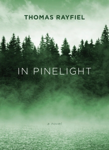
When I first saw this cover, I was stunned—stopped in my tracks, much like The Grievers.
I loved this cover!
Much like my discussion of Grace, this cover also brings me back to my life in the Adirondacks of upstate New York. The North Country. If you haven’t guessed it yet, I had a great upbringing. I loved where and when I grew up. Love the wild lands…the brooding mysteries of the dark waters and woods. I spent so much time roaming the woods on my own…hanging out at the lake across the road from our house. Soaking in this cover really brought it all back. Now, the story itself…it’s method of delivery…did not work for me. I wanted it to…because of the cover…because of the subject matter (an upstate NY town that was flooded out)…but simply couldn’t. It simply didn’t work for me.
But…back to the cover…I love the feeling of foreboding…the mystery…the darkness. I love the trees and all their shadows…how trees and shadows and mist-over-water lends toward an implied deep, dark mystery…implied goings-on that are hidden in either-or-both the water and the woods. Again, since I had not finished reading this novel, I can only guess…but it all implies some dark dealings going on in some dark woods…and/or water. Back country secrets….
I can feel the crisp coldness of the water…the resilient bounce of the humus-carpeted forest floor…inhale the heavy scent of the pines. Feel myself weaving in and out between the trees…moving deeper into the mystery forest and snapping off dead branches as I go. Holding the stiff, dead branches in my hands as I trek ever farther into the woods…listening to the distant woodpeckers and the wind….
Yet above it all is the sky with rising ground fog.
Whatever darkness lies below…there is “a light at the end of the tunnel”—or, in this case, “above the trees.”
But in the woods there be secrets.
“Book covers are visceral,” Lon says it best on his book-cover-dedicated website, lonkirschner.com. “A good cover grabs you in an unexpected way,” he goes on to say, and In Pinelight had done just that…much like Grace had also done for me. Some covers you “just like”…they’re eye candy, they’re cute, they’re whatever (in a good way)…and some just immediately get under your skin and into your marrow. And that’s what’s happened in In Pinelight. Lon’s work has a “heart” to it…and maybe it’s because he reads every manuscript for which he creates a cover. Maybe he’s just good.
No “maybe’s” about it!
So, yes, I think In Pinelight has become one of my favorite covers.
What went through Lon’s mind as he worked this cover?
Here are his words:
“Yes, you are correct. This was a difficult book to read because it uses no punctuation or paragraphs. It is the ramblings of a thought process put to words. As you know, I make a commitment to read every book so I can (hopefully) get it right. The author gave me a warning about the quirky style of this book so I was prepared. It was a slow start, you had to get into the rhythm of it. I found myself enjoying it because it was like I was uncovering a mystery. Sometimes you had no clear idea what was going on but then out of nowhere you made a connection. You are the listener to this man’s oral history of his life. It was a strange life with many twists and turns but the constant was the lake and the trees. You would feel their presence on almost every page, it was the natural way to go. The problem was to find an image that had the right sense of place and mystery. I came across an image that felt good but there were things that just were not right. Fortunately we are able to make corrections with the tools we have available to us. The shape of the tree line wasn’t quite right. There were a few disturbing branches and several tall trees sticking too far up above the rest. The trees had to look a little other worldly. This was fixed by pushing the color toward the almost unnatural green. The final element was to enhance the mist coming off the water. These were all relatively simple to do but combined to change a rather ordinary photo into the type of image that can stir up all sorts of emotions and memories as it did with you.
“The final element was the font choice for the title and author. I felt strongly that this had to be extremely simple so it would not compete with the image, the real star of the show. A clean sans serif font solved that problem.
“This publisher had requested to see several concepts. When I did this one I knew the job was done but did the others and submitted all together. To say I was not surprised when the Art Director emailed me with the news that this was the choice is an understatement. One, it made me feel like I really did know what I was doing and two, I knew the Art Director was smart!
“It is actually harder to do a book like this because it is really a mood piece. So much of the work I do is compositing and creating original art that piece together a book in a visual way. This type of cover is much more visceral and relies on pure emotion to get the concept across. Another interesting fact is that you were drawn to the book and wanted to read it but in the end, your enjoyment of it came from the cover and not the text.”
Ha—I like how Lon points out that my enjoyment of the book came from the cover and not the text! This is quite ironic for a writer, because so many authors complain about their covers because they feel the traditional publishing houses have “slapped on” some trite, awful cover to their manuscripts…covers (these authors lament) that have little to do with actual story…or are just plain heinous, with little thought or effort having gone into them….
Thank you, Lon, for your insight! Maybe some later day I’ll again attempt to complete reading this novel…and I’ll definitely check out his other, Time Among The Dead.
Thomas Rayfiel doesn’t appear to have his own website, but here’s his Amazon page.
*******************************************
Lon Kirschner may be contacted at:
Phone: 518/392-3823
E-mail: info@kirschnercaroff.com
Site: http://www.kirschnercaroff.com
Book Cover Site: http://www.lonkirschner.com/
Related Articles:
Kirschner Cover Art: Grace, by Howard Owen (fpdorchak.wordpress.com)
Cover Artist Lon Kirschner Interview (fpdorchak.wordpress.com)


