• Skip to main content
  • Skip to footer

F. P. Dorchak

Speculative Fiction (New Weird) Author

  • Home
  • Books
    • What Readers Are Saying
  • Short Stories
  • About
  • Blog
    • Runnin Off at the Mouth
    • Reality Check
  • Events
  • Contact

Art

Updated Headshot Portfolio

July 6, 2016 by fpdorchak

This Is Me. Take It Or Leave It. (Image by Jan C J Jones, Freelancer Ink, © July 1, 2016)

Last Friday I finally got around to updating my social media photo portfolio I use for writing promotion. I’d been putting it off for a couple years…for different reasons. Chief among them was the weirdness, well, of just doing so… you know, looking into a camera lens that’s all focused on me… your truly. Sure, I studied modeling, but, geez, that was 28 years ago! Also, it was just finding the time to put out the effort to do so. We’re all busy (a term quite “used” today). Yet, as more gray hair began emerging upon the sides of my head I thought, well, I better get on it. I hate it when public figures use images of when they were twenty years old and I meet em…and they’re not. Be proud of who you are, dammit, and be honest about it…wrinkles, gray, and all!

So…I finally gave in. I want my headshots to be an honest portrayal of me and I didn’t want to be freaking lazy about that. Because writers need headshots to send to outlets that ask for them. When you guest blog, blog hosts (rightly so—I’ve asked for them of those I’ve interviewed) want headshots. Readers wanna know what we look like…I get it, it’s a natural curiosity. Turnabout is fair play.

So, I gave my friend, Jan C J Jones, a call. Hey, Jan, what can you do fer me? I just want two or three headshots….

Well, as is normal for Jan, I wasn’t just getting two or three mug shots. Nope. Jan don’t work that way. About anything. When you ask Jan for a favor…you get 1,000% of her attention and creative concentration…and there’s just no easy way of saying this: she just blows things out of the water….but for YOU. Her creative mind is always cranking and now I’d just put myself [back] on her radar.

Oy, what have I done?

Yes, I’ve been there before! Jan is an amazing person, and if you ever get the chance to work with her, drop whatever you’re doing and do it! It’s humbling and awe-inspiring! From her website:

“My strength is understanding story structure and audience psychology…knowing what the viewer “needs” to see, and when, in order to keep them engaged, entertained, and satisfied with their viewing experience.” [www.forest-rose-productions.com]

And she ain’t no slouch there. I was far from being her first rodeo on the subject. She manipulated me for my photo shoot like the consummate professional she is. It did actually bring me back to my short-lived modeling “career.” She’s done this for a living, among other things, as a film producer, screenwriter, video editor, artist, tutor, and author. You’ll note I said “among other things.” She’s won awards and co-produced a retrospective touted as the “quintessential history of Disneyland,” for Buena Vista Home Video (a Disney company). Her current project is titled, “A Journey with Strange Bedfellows,” is a classic Victorian “steampunk” Gothic horror audio drama that is also a graphic novel, music album, and educators’ guide, and it’s really cool! [www.a-strange-journey.com] See? She even goes all-out on her own work, spreading it out across multiple platforms! Jan is just plain fun to work with!

Anyway, no sooner had I opened my mouth, when she started talking costumes and props and location scouting…and I had to throttle her back right there, because I’m not into lions and tigers and bears, oh—dang it, really? Now I gotta go location scouting?—but she did get me to thinking. I did have to, you know, wear something…so whether or not you call them “costumes,” you do have to think about what you’re gonna wear. Patterns, Jan tells me, really aren’t what you wanna wear…it’s distracting…unless that’s what you want to do. So, okay, Jan, fine, you win on that account. I put out an array of clothing (aka “costumes”) and she selected the best of them for our purposes.

Props: no, Jan, I’m not into “props”…just me…you know…a couple-a-headshots…bing, bang, boom!…we’re done. Don’t wanna abuse your time and all because I do know how busy you are and you’re semi-retired, and, but on the way out of the house, I thought, huh—props? How about—

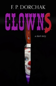
So, I grabbed our largest kitchen knife.

Crap: she got me there, too. I now had a “prop” in my possession (um, wrapped in a towel, you know, because walking around out in public with a large, shiny knife….).

Jan C J Jones, Forest Rose Productions, LLC.

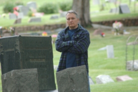
During the couple of weeks leading up to all this she kept pinging me on how my location scouting was doing.  Fine, I said. Kinda. Had all kinds of excuses for not doing it, cause, you know, this was just gonna be a couple-a-headshots…but I thought, okay, she has a great point here. My original intent was an hour or two shoot around the house, maybe Garden of the Gods…or, hey, how about…yes!—how about a cemetery! I mean my writing is all about peeking behind that thin caul of reality, right? Buncha short stories about graves, and death, and dying? One with a knife, even (“Clowns“). There is a cemetery I really like in the area, large deciduous trees and all…a kinda Night of the Living Dead look to part of it. As to Garden of the Gods, Jan told me that shooting in well-known locations can be problematic…possibly requiring permits, yada x 3. I really wanted to make this easy on Jan, so—<buzzer sound!>—that was out. But, the more I thought about the cemetery, the more I liked it! We also used the gardens of a mausoleum we both knew of.

But let me clarify…I didn’t want it all about cemeteries. But cemeteries and their ilk can have cool surrounds…leafy trees…beautiful landscaping…and that’s why I chose those two locations. We could shoot the creepy stuff…but also accentuate the portfolio with non-creepy stuff, and (pardon the pun) kill two birds with one [grave]stone. By the way, cemeteries sometimes have such incredible artwork…but few will see it…or only see it in times of great emotional distress…so will miss the beauty of the artwork in and itself. I do recommend you find a cemetery with such artwork, and just walk through it with a clear head…you might just be amazed at what you find!

So…<sigh>…Jan got me there, too, with location scouting. Good thing I “throttled her back” right at the onset.

So we headed out!

It was an overcast day, which turns out to be perfect for photography! The uniform lighting! There was a forecast for “a chance of rain,” but it never materialized. Maybe a sprinkle or two, but nothing thunderous and sheeting. So, it worked out beautifully. We shot at the cemetery, the mausoleum, and my home. The sun came out at the tail end of our photo shoot…too much squinting for yours truly, so we ended all that. Then we brainstormed a couple of special effects (SFX) set-ups we could do…so we took a couple of “staged” shots for those that would look odd in a portfolio if you didn’t know why they were there (like “back” or “butt” shots of me on a step stool against a white wall…backlit shots in the garage…these would be SFX’d if needed), and Jan worked her magic on some of them and they turned out totally cool! We ended up with just shy of 500 shots…but since some were taken in preparation for SFX work, and some we were simply experimenting with, not all will see the light of day…and to be honest, after a while of going through a lot of them (I still haven’t gone through all of them), I’m getting tired of my own face….

But.

Now I have up-to-date images I can send to those who request them. I’ve already begun to update my social media Gravatars and all. I even have some images we can mess around with for cool effects. Jan really went light-years out of her way in helping me get far more out of my simple request than I’d even dreamed of. And, again, that is just how she operates. She’s not half-assed about anything she does…and she will get you to think in directions you never considered thinking or going. Granted, this may be a “minor” example, but it’s salient. I’ve known and worked with Jan for years, and this is how she operates in everything she does. She’s quite simply a most wonderful woman!

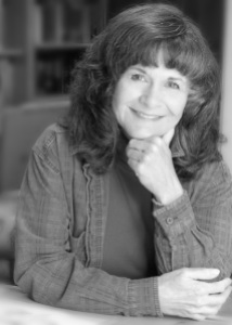
So…I’m a bit apprehensive to include any photos here, because I really don’t want to appear narcissistic…as I said, I’m quite over looking at my own face…but I thought it might be appropriate because of my previous modeling post…and to show some samples of Jan’s work. So…okay, I’ve included a few of the shots we took. We had fun, experimented, and came up with some good images I can use for a good couple years…and for that, I am extremely grateful and indebted to Jan for her experience, expertise, and friendship. Thank you, Jan, for taking an entire day out of your busy schedule to help a guy out!

This slideshow requires JavaScript.

Jan C J Jones, Executive Producer/Writer, Forest Rose Productions, LLC, Information

Forest Rose Productions, LLC

Forest Rose Productions, Facebook

Facebook

PO Box 1948
Monument, CO 80132
719/487-0435

E-mail: jcjjones@aol.com

Strange Bedfellows Project: www.a-strange-journey.com

Related Articles

My Short-Lived Modeling Career (fpdorchak.wordpress.com)


Filed Under: Art, Fun, Leisure, To Be Human, Writing Tagged With: A Journey With Strange Bedfellows, authors, Cemeteries, Forest Rose Productions, Headshots, Modeling, Photography, Portfolio, Weird Fiction, writing

New Business Cards – Paranormal Fiction Writer

June 4, 2016 by fpdorchak

Paranormal Fiction Writer (Design © Lon Kirschner and F. P. Dorchak)

Well. Susie posted that she got new plates, so I’m posting that I’m getting new business cards!

Lon Kirschner designed them and this actually came from a section of my bookmarks that he also designed. I love the solid black, which is like the unknown, or “like a mysterious void,” a friend said. So now I got a “brand” goin’ on. I like it.

Bookmark (Design © Lon Kirschner and F. P. Dorchak)

Love the “paranormal green,” I’m calling it, on the back of the card. Love the overall simplicity of design. The minimalist design. The front will be laminated and the back will not be, so it can be written upon.

Back of Card (Design © Lon Kirschner and F. P. Dorchak)

I’ve been needing to create an updated card I can give to everyone, one with my correct [public] e-mail address, so I can stop crossing out the old one on the old cards I’ve been using. I’m also getting ready to take some new head shots and such, through my friend Jan C. J. Jones. While I still look quite like my basic head shot-by-the-pine, and my sailing shot, et cetera, I do have just a touch more gray in there! So…

I’m trying to give things a face-lift of sorts.

I will be attending the Denver Comic Con (DCC) June 18th (for a book signing) and 19th, for two panels:

  • Dealing with Discouragement in Writing & Publishing, June 19, 12:15 – 1:05 MT
  • Why We Write Short Fiction, June 19, 2:15 – 3:05 MT

This will be my first DCC attendance, and I’m looking forward to it!

Lon Kirschner may be contacted at:

Phone: 518/392-3823

E-mail: info@kirschnercaroff.com

Book Cover Site: http://www.lonkirschner.com/

Related Articles:

  • Kirschner Cover Art: “Clowns,” by F. P. Dorchak (fpdorchak.wordpress.com)
  • Kirschner Cover Art: In Pinelight, by Thomas Rayfiel (fpdorchak.wordpress.com)
  • Kirschner Cover Art: Grace, by Howard Owen (fpdorchak.wordpress.com)
  • Cover Artist Lon Kirschner Interview (fpdorchak.wordpress.com)

Filed Under: Art, Books, Fun, Writing Tagged With: Business Cards, Design, Lon Kirschner, Paranormal Fiction

Kirschner Cover Art: "Clowns," by F. P. Dorchak

April 4, 2016 by fpdorchak

"Clowns," © F. P. Dorchak and Lon Kirschner, 2016.
“Clowns,” © F. P. Dorchak and Lon Kirschner, 2016.

Okay. Yes. I know…shameless, shameless self-promotion!

But I’ve wanted to talk about this cover since I first laid eyes on it…or it had laid eyes on me….

As I’d previously mentioned, I’d been (and still am) messing around with short stories, and had come across this one and decided to published it as its own stand-alone story. So, I turned to Lon Kirschner, who’d done a couple of my other covers. As always, Lon turned out a fantastic cover! It even reminded me of The Grievers, the cover he’d done for Marc Schuster, back in 2012 (and also involving clowns, by the way).

So, of course I want to talk about it!

When I first opened the file and looked at it, the very first thing I saw was the clown’s face…and I thought, ewwww…how frigging creepy! But…why is it starting at me through a slit?…a narrow opening…a…waaait a minuuute—

BOOM!

It hit me, just like that—the clown was staring at me from the blade of a knife!

I bust out laughing.

How frigging perfect!

I was walking around the house with my tablet looking at this thing and laughing my ass off. I just couldn’t take my eyes off it! What a perfect cover for my short-short story! The creepy clown face, the purple from its little clown-doll outfit, the kitchen knife, the script of the title—including the red “S”—all on a black background, which to me symbolizes the night/unknown! It was such a clean, subtle, no-nonsense creepy (have I mentioned this?!) cover!

I mean, our clown…the silly little dresser-top doll…the subtle way it’s peering out at us from the shiny knife blade is just like how I believe these little bastards are peering out at us from our dresser tops! Oh-so slyly…are they…or are they just staring ahead with their lifeless, beady little eyes?

Of course they’re staring at us!

This is what Lon had to say about creating my “Clowns” cover—which, by the way, was the first time he’d ever created a cover for a short story—I think you’ll really get a kick out of this:

“It did creep me out. I don’t really mind real clowns (although they are a little odd) but clown dolls are what I really find creepy. I also find some other types of dolls creepy but that might be just me. When we were kids we had a set of Raggedy Ann and Andy dolls that my Aunt sent from her travels in Europe. They sat on the old radiator that was in the bedroom I shared with my sister when we were very young. I would wake up some times in the middle of the night and I would see them staring at me. Like your story. I still think they moved.

“The other issue with this cover was I knew you had high expectations for this and I felt a little under pressure to produce something that hinted at the story but didn’t give it all away.

“I wanted it very, very simple but have that disturbing feeling. I went back and forth with the alternate “S” in ‘Clowns.’ At first I thought it was a bit cliché, but then I thought it was a good way to bring in that murderous element without being overly gruesome and it did offset that typical circus lettering.

“My own clown issues and creating a successful piece all combined to create something a little difficult to work on, but in reality, once I got going it all fell into place rather quickly.

“I always start with some sort of rough idea. I knew I didn’t want to see the whole clown face and I knew I needed a knife, I just wasn’t exactly sure how they would all meld together.

“This is how I have always worked. Some people sketch it all out exactly but that never worked for me. I do make little sketches on Post-it notes to sort some things out, but that is usually as far as I go. I find the fun in moving things around and making my adjustments on the fly. I think I moved the image of the knife over at one point about a sixteenth of an inch. Then I was satisfied!”

I love this line: “I still think they moved“!

I also like how Lon didn’t want to “give it all away,” which I could see might be a little difficult to do in a quick short short story of less than 800 (713) words! But, he did it, I’m proud of him and his result, and I am still beside myself over the cover!

So…I hope you’ll excuse me for analyzing one of my own, but I’ve been wanting to talk about it since I got it. With my next Kirschner Cover Art post, I’ll go back to talking about other author covers….

But…for now…sleep with one eye open!

Do you know where your knives are?

*******************************************

Lon Kirschner may be contacted at:

Phone: 518/392-3823

E-mail: info@kirschnercaroff.com

Book Cover Site: http://www.lonkirschner.com/

Related Articles:

  • Kirschner Cover Art: In Pinelight, by Thomas Rayfiel (fpdorchak.wordpress.com)
  • Kirschner Cover Art: Grace, by Howard Owen (fpdorchak.wordpress.com)
  • Cover Artist Lon Kirschner Interview (fpdorchak.wordpress.com)


Filed Under: Art, Book Covers, Fun, Leisure, Short Story, Spooky, To Be Human, Writing Tagged With: Clowns, Cover Art, Graphic Artists, Jesters, Kirschner Caroff Design Inc, Knives, Lon Kirschner, Marc Schuster, Short Stories, The Grievers

Kirschner Cover Art: In Pinelight, by Thomas Rayfiel

January 18, 2016 by fpdorchak

In Pinelight, by Thomas Rayfiel, Triquarterly (Publisher), 2013

When I first saw this cover, I was stunned—stopped in my tracks, much like The Grievers.

I loved this cover!

Much like my discussion of Grace, this cover also brings me back to my life in the Adirondacks of upstate New York. The North Country. If you haven’t guessed it yet, I had a great upbringing. I loved where and when I grew up. Love the wild lands…the brooding mysteries of the dark waters and woods. I spent so much time roaming the woods on my own…hanging out at the lake across the road from our house. Soaking in this cover really brought it all back. Now, the story itself…it’s method of delivery…did not work for me. I wanted it to…because of the cover…because of the subject matter (an upstate NY town that was flooded out)…but simply couldn’t. It simply didn’t work for me.

But…back to the cover…I love the feeling of foreboding…the mystery…the darkness. I love the trees and all their shadows…how trees and shadows and mist-over-water lends toward an implied deep, dark mystery…implied goings-on that are hidden in either-or-both the water and the woods. Again, since I had not finished reading this novel, I can only guess…but it all implies some dark dealings going on in some dark woods…and/or water. Back country secrets….

I can feel the crisp coldness of the water…the resilient bounce of the humus-carpeted forest floor…inhale the heavy scent of the pines. Feel myself weaving in and out between the trees…moving deeper into the mystery forest and snapping off dead branches as I go. Holding the stiff, dead branches in my hands as I trek ever farther into the woods…listening to the distant woodpeckers and the wind….

Yet above it all is the sky with rising ground fog.

Whatever darkness lies below…there is “a light at the end of the tunnel”—or, in this case, “above the trees.”

But in the woods there be secrets.

“Book covers are visceral,” Lon says it best on his book-cover-dedicated website, lonkirschner.com. “A good cover grabs you in an unexpected way,” he goes on to say, and In Pinelight had done just that…much like Grace had also done for me. Some covers you “just like”…they’re eye candy, they’re cute, they’re whatever (in a good way)…and some just immediately get under your skin and into your marrow. And that’s what’s happened in In Pinelight. Lon’s work has a “heart” to it…and maybe it’s because he reads every manuscript for which he creates a cover. Maybe he’s just good.

No “maybe’s” about it!

So, yes, I think In Pinelight has become one of my favorite covers.

What went through Lon’s mind as he worked this cover?

Here are his words:

“Yes, you are correct. This was a difficult book to read because it uses no punctuation or paragraphs. It is the ramblings of a thought process put to words. As you know, I make a commitment to read every book so I can (hopefully) get it right. The author gave me a warning about the quirky style of this book so I was prepared. It was a slow start, you had to get into the rhythm of it. I found myself enjoying it because it was like I was uncovering a mystery. Sometimes you had no clear idea what was going on but then out of nowhere you made a connection. You are the listener to this man’s oral history of his life. It was a strange life with many twists and turns but the constant was the lake and the trees. You would feel their presence on almost every page, it was the natural way to go. The problem was to find an image that had the right sense of place and mystery. I came across an image that felt good but there were things that just were not right. Fortunately we are able to make corrections with the tools we have available to us. The shape of the tree line wasn’t quite right. There were a few disturbing branches and several tall trees sticking too far up above the rest. The trees had to look a little other worldly. This was fixed by pushing the color toward the almost unnatural green. The final element was to enhance the mist coming off the water. These were all relatively simple to do but combined to change a rather ordinary photo into the type of image that can stir up all sorts of emotions and memories as it did with you.

“The final element was the font choice for the title and author. I felt strongly that this had to be extremely simple so it would not compete with the image, the real star of the show. A clean sans serif font solved that problem.

“This publisher had requested to see several concepts. When I did this one I knew the job was done but did the others and submitted all together. To say I was not surprised when the Art Director emailed me with the news that this was the choice is an understatement. One, it made me feel like I really did know what I was doing and two, I knew the Art Director was smart!

“It is actually harder to do a book like this because it is really a mood piece. So much of the work I do is compositing and creating original art that piece together a book in a visual way. This type of cover is much more visceral and relies on pure emotion to get the concept across. Another interesting fact is that you were drawn to the book and wanted to read it but in the end, your enjoyment of it came from the cover and not the text.”

Ha—I like how Lon points out that my enjoyment of the book came from the cover and not the text! This is quite ironic for a writer, because so many authors complain about their covers because they feel the traditional publishing houses have “slapped on” some trite, awful cover to their manuscripts…covers (these authors lament) that have little to do with actual story…or are just plain heinous, with little thought or effort having gone into them….

Thank you, Lon, for your insight! Maybe some later day I’ll again attempt to complete reading this novel…and I’ll definitely check out his other, Time Among The Dead.

Thomas Rayfiel doesn’t appear to have his own website, but here’s his Amazon page.

*******************************************

Lon Kirschner may be contacted at:

Phone: 518/392-3823

E-mail: info@kirschnercaroff.com

Site: http://www.kirschnercaroff.com

Book Cover Site: http://www.lonkirschner.com/


Related Articles:

Kirschner Cover Art: Grace, by Howard Owen (fpdorchak.wordpress.com)

Cover Artist Lon Kirschner Interview (fpdorchak.wordpress.com)

Filed Under: Art, Books, Leisure, Writing Tagged With: Book Covers, Cover Art, Forest, In Pinelight, Lakes, Lon Kirschner, New York State, Publishing, Thomas Rayfiel, Trees, Waterfalls, Woods, writing

What Does it Take To Release A[n Indie] Book?

October 2, 2015 by fpdorchak

Besides the actual writing of the novel, there’s the publishing of it. The transformation from a manuscript to a book. Sometimes that can feel like it takes just as long as the creation of the manuscript (ms)! One of my friends and a reader told me she was amazed at what goes on in the background “just” to release a book—she told me she couldn’t believe everything that has to get done!

So, in honor of her (let’s call her “Edie”!)…this post. Below I’ve attached (as gracefully as I can in the ever-changing environment that is WordPress) my publishing checklist…but I’ll step though an overview of the process. For an overview of the overview, take a quick scan of how long this post is. Just sayin’.

In the traditional world, unless you’re releasing a book that begs immediate release for whatever reason (e.g., rich and famous and/or timely issue), it typical takes about a year (or so) to get all your loons in a row to release it. The steps I do are pretty much the same…I just don’t have the bankroll nor staff they (being “them”) have, so I make do with what I can and am lucky enough to have some stellar people who help out. I truly wish I could pay all of them for all their efforts (at the going rate), but that’s the reality of independent publishing: the kindness of friends and writing peers and the “poorness” of Indie authors.

But do be aware: it does cost.

Going Indie is a not a freebie enterprise. Sure, you can put out a cheap-looking, low quality effort, but you’re going to hurt yourself in the long run. And if you do finally gather your wits (and resources) about you and do end up putting out higher quality efforts…you’ll have that one (or three…) crappy effort out there unless you go back and redo what should have been done right in the first place.

Would you buy a poorly created book?

So, throttle back on the excitement and take a breath. Do it right.

Okay, you think you’re done with your ms. So now you need to take a break, right? Yes and no. Even before you’re done, it’s always good to keep your eyes and ears open for those you’ll be needing for the release of your work, and the earlier the better (and contacting those you’ll want to work with to see about fitting into their schedules is a must): you’ll need the following efforts “covered” (pardon the pun):

  • Cover
  • Interior formatting
  • Proofreading/copyediting
  • Blurbs (you don’t really need these)
  • Author photo (you don’t really need this)
  • Book reviews
  • Book creation: paperback/hardback/ebook
  • ISBNs
  • Library of Congress copyright copy
  • Book distribution
  • Promotion. Forever promotion….

Cover

For the cover I’ve used two different folks. I’ve used Karen Duvall, of Duvall Design, and Lon Kirschner, of Kirschner Caroff Design Inc. It just depends what kind of budget you have. Karen (and most cover artists, especially in the traditional world) doesn’t read your work and engages you from the very beginning. It’s very give and take from the get-go. I’ve known her for years and she’s a great person. Another great person to work with is Lon Kirschner. Lon reads your entire ms and comes up with the cover on his own. If there’s something about the cover that doesn’t quite work for you or needs tweaking, then he’s also more than willing to work with you until he gets it right. I love working with both these folks, they’re terrific people and do outstanding work! Contact them for their current rates and to get on their schedules. I know Lon’s been recently slammed with work.

Another note about cover: you need to present the most professional, high quality cover you can [afford]. People do judge a book by its cover. It’s usually the first thing anyone sees. The first thing one rejects. Compare what’s on the shelves and what’s professional quality against what you think you want on your cover. The harder it is for another to determine if your work came from a traditional publisher, the better.

Interior Formatting

Through a writing friend, I found Pam Headrick, of A Thirsty Mind Book Design. She formats your content (i.e., file) into the proper format to get it into that trade paperback or ebook. There’s a lot to do there, but it’s dealing with spaces and “code.” She works her internal wizardry so well and is also easy to work with! Sometimes we go back and forth for a couple weeks, depending on what the issues are—and they can be many and varied, especially Microsoft’s “overhead code” issues. On Voice we had a danged coding issue that literally kept rearranging words on a particular page—on its own. Oh, the Humanity! Pam finally had to delete the entire page and manually retype it! You definitely need to contact Pam early (however defined) and see what her schedule is and get on it—you can always shift schedules, but this woman is frigging busy.

Proofreading and Copyediting

Here’s where I rely on “the kindness of strangers.” If I were to pay the going rate of what these people do, it would run upwards of $3-$5K—at least that was the last going rate I’d research a couple years ago. I simply cannot afford that. Fortunately I’ve found people who love doing this kind of thing and wanted to help out. And if they were writers, I’d gladly return the favor. They’re readers and they love helping out “the cause,” and for that I’m eternally grateful! I just can’t thank them enough! So I pay in contributer’s copies: however many they need/want, I’ll send them (well, short of a truckload at at time, I only have so many resources you know…), and give them acknowledgements in my novels’ front matter (the front of a book before the actual story). So use those you find to their expertise: are they good readers? Good with grammar? Continuity and details? Do they read a lot? The important thing is to just get another set of eyes on your words. Some will give you in-depth detail and others will give you an overview. Both are great inputs. Edie is a huge reader and Mandy has written lots of proposals. Edie gives me an overall reader’s point of view, while Mandy gives me hell-on-each-sentence (okay, its not really that bad—but she knows her stuff)—which is as it should be! It’s up to you how you wanna run this part of things, but get others to read your efforts before going public.

Once you parse your work out to your readers, give a timeline…and allow for some slack. People are people and they have their own lives and issues do pop up. You don’t want to cut it so close that the rest of your release process suffers, you don’t want to overburden your proofreaders, and you don’t want to short-change yourself—or the work itself! The good part about all this is that is that you’re running it, so you create your own schedule. I’d say a month is too short, better two, depending on the length. It will probably end up being three. If it’s over 100K words, I’m betting it’ll take about three months for your in-depth redliner to “go deep”…and it gives that person or persons time to actually write this stuff up to send you. Reading is easy…communicating their comments to you takes time (and effort). Let them have it. If they’re helping you out, they want to do this.

One thing I’ve found in the creation process (while you’re still actively writing the story, way before sending it out for review and release) is to get to a point where your ms is in fairly decent shape, then read every word of it aloud. This is way before you think you’re “done.” I do that with all my mss. It’s usually around the third or fourth draft. There is so much you can catch, from pacing errors to misspelled words. You’d be surprised. Try it.

But, you’ll still miss stuff anyway and your readers will find them.

Blurbs

I feel you don’t really need these, but they don’t hurt. I was against them for a while because I’d discovered that many blurbers in the traditional world didn’t actually read the works they blurbed. Yeah, that floored me. I hope that isn’t the case anymore, but somehow I feel it probably hasn’t changed much. So, this is up to you. Those I’ve had blurb my work have actually read it. It doesn’t hurt, but last I read the jury’s out on who feel they’re legit and those who feel (as I did) that they’re B.S.

Author Photo

Do you want to include a photo of yourself on your book? I’m not big on that, but I’ve done it in two instances because it seemed “part” of the novel: on ERO I included a picture of me when I was a captain in the Air Force, because my novel was about an Air Force officer. It wasn’t a current shot, was over 20 years old, but it fit the story. I got the idea from a writer friend of mine who did it on one of his books. And in the ebook copy of Voice, I did it on the interior the back matter of the ebook, again with another near-thirty-year-old modeling shot of me when I was into modeling back in the 80s. It, too, fit the story, which deals with models and photography. I didn’t include it on the paperback hardcopy because I loved the clean look of the cover as Lon designed it. I didn’t want to mess with his simplicity of design. I probably could have included in on the interior back matter pages, but don’t think I thought of it until I was “done” with the paperback production and was into the ebook formatting later.

Book Reviews

This one should typically do some 4-6 months or so out.

Look, I’m just one guy…I simply don’t have the time to do all this stuff smartly. But this time I did manage to get two writers/reviewers to write a review of Voice, but it was only about a month out. I sent them electronic versions of the files. So, if you do find yourself in the position to do this, get someone (like a “Pam”) to do you up an “advance review copy” e-version and send it out to anyone you can find to give you a review. I’m not an expert in this area, so you’ll have to search the Internet for better information on this area of book release.

Book Creation

There are various way so of doing this, but I use CreateSpace for my trade paperbacks. Many “traditional” folk like to rail on against CreateSpace/Amazon…yet still use them for their own book sales. That’s hypocrisy. I like CreateSpace!

For now, I’m using them and I’m quite happy with them. And they had replaced a boxload of books that had been damaged and sent the replacements within days—yes, that same damned week!—and sent two more books that I had originally ordered. I have no beef with them whatsoever, so call them what you will, but I like them.

I use Smashwords for the ebook creation, with the exceptions of Amazon’s KDP (not KDP Select) and B&N’s Nook. I load these last two manually and do not use Smashwords for their distribution. I’ve been told that Smashwords lags behind in providing royalties on these last two distributors, though I do know Smashwords has modified its distro a bit (using Amazon’s KDP is about ebook creation).

It is still recommended that one not go with KDP Select. KDP and KDP Select are two different animals. Be careful when selecting these that you know what you’re selecting. I’m not going to get into all the reasons and have to not go KDP Select, I have to leave that up to you to research. This post is long enough!

I do recommend doing both a trade paperback and an ebook—if you can swing the finances (I’ve recently read that ebooks are beginning to lose traction). For a trade paperback you’ll not only need a front cover—but the entire wraparound cover. Cover rates should be different if you’re just doing a front cover.

Also, Nook requires a cover less than 2 MBs, so keep this in mind when ordering your files.

My checklist below has the steps and things to check out for in creating the actual books, paperback and ebook.

If you’re doing CreateSpace you’ll have the option of printing a “proof” copy. I highly recommend this…a couple copies. You’ll get a version of the book (you’ll have to pay for it, but it’s cheap) sent with “Proof” stamped on the last page, but you’ll actually see your book as it will be once released. You can always change things about your book after it’s published, but do it right the first time and get that proof copy. Review. Flip through it, checking for faded graphics, text placement, weird spacing, cover issues, et cetera, read it, if you haven’t recently or haven’t had others proof/copyedit it.

When you’ve entered all your ebook info, be careful it’s all correct, because once you hit that “Enter” a the end, that baby’s live!

ISBNs

ISBNs are different for ebooks and paperbacks.

At CreateSpace you have the option of different kinds if ISBN creation, and I always opt for the custom (see checklist below). For ebooks, the various ebook outlets have their own ways of doing business, so make sure you read the details and make sure you understand what it being said.

Again, you cannot use the same ISBNs for the paperback for the ebooks, and vice versa.

Library of Congress Copy

Always register the hardcover/paperback versions of your books with the Library of Congress. If you just have an ebook, you can register that, as well. The cost is minimal. Again, I’m letting their website do the talking, but if you get a copy of your book there within 30 days of release, you are afforded extra copyright protection.

Book Distribution

If you do CreateSpace, you don’t do traditional distributors, like Baker and Taylor. Your distro is Amazon.com. And though Amazon.com is not technically a distributor, they act like one.  If you do ebooks, like Smashwords, Nook, etc., you do all kinds of distribution. Check out their sites. So, if you want to get your physical books into bookstores, your best bets are indie bookstores or local used-bookstores…some are willing to take on local talent. Some Bigger Box/Indie stores will also take on local talent. I’m finding that the Bigger Box/Indie stores will consign your work, while the used books stores I’m dealing with usually buy your books outright. They’ve always been pretty easy to work with and will add a little to the buying price so you make some money.

Promotion

You’re never done. Ever.

As I’ve wrapped up everything else in the creation process, I’m now actually trying to actively promote Voice. But this never ends. I suggest creating—at minimum—a Word file and just begin adding and copy-and-pasting ideas and possible avenues in there as you go about your life. Links to newspapers,  reporters, ideas for tweets, bookstores, events, anything and everything you have even the vaguest interest in checking out and/or pursuing. Nothing’s “stupid” at this point. You can weed out later.

I created a whole list of tweets, then, through this Future Tweets site, programmed in all these tweets for Labor Day weekend. There’s also a kinda cool “flip the tweet” function, where the tweet is actually flipped upside down—I love that!

Many of us do have day/night jobs and cannot spend all day on this kind of thing, so all we can do is what we can do. Don’t beat yourself up over it, don’t kill yourself. Sure, there are indignant authors out there who’ll dump on you (if not in words…in tone and attitude—and, yes, I’ve met them) and your seemingly puny efforts because they are writing full time, or have a significant other who supports them so they can write…but if you’re that one who is working and writing…all you can do is what you are doing. Feel good about it and don’t go killing yourself over “having” to do something every second or at the expense of ignoring your family/significant others/your own health. Do remember your quality of life. You’re YOU. You’re not “them.”

BE you.

Note

When agreeing to book signings and the like, do make sure you both totally understand what is being proposed when setting up gigs…as in contacting local media and dates and times! Pay attention to detail and who’s supposed to do what.

And have FUN!

Okay, here is my checklist:

Prepping ms for Pam:

  • Convert to:
    1. TNR.
    2. Only single spaces, no double spaces.
    3. Single-spaced lines, no double spaces.
    4. No more than 4 lines of spaces (returns) at the tops of any e-book pages.
    5. For paperback books, make sure all the line returns to chapter starts are the same.
    6. E-book only: Add a space after all ellipses (3 and 4 dots), except w/in quotes, parens, punctuation (this may no longer be needed).
    7. Make sure abbreviated years are correct—use an apostrophe: “ ’78 .”
    8. Convert all dashes to M-dashes (N-, just be consistent).
    9. Check all sub-section spaces/#/***; standardize, check spacing, and center.
    10. Check all chapter and section numbers (1, 2, 3…) are correctly numbered.
  • Spell check—again!!!
  • Check for these words: http://sirragirl.blogspot.com/2014/04/collection-of-commonly-confused-misused.html?m=1
  • Ensure italicized text are properly italicized (including appropriate punctuation within itals).
  • Can’t have text “left/right-justified-at-bottom-of-page” kinda thing for ebooks (see ERO front matter for example).
  • Blurbs from other authors?
  • Add “Also by F. P. Dorchak” to front matter. See below.
  • Add family members to Notes/dedication?
  • Add others to Notes/dedication. Think.
  • Add cover graphic to title page.
  • Check any interior graphics for recto/verso placement.
  • Add websites and social media links to e-books.
  • Keep paperback clean with just “About” and website.
  • Bibliography?
  • When using Pam in formatting, it can take many iterations of PDFs to get formatting correct, because PDF keeps changing things we do not touch! It can take a week or two to iron out all the annoying shit PDF does.

Submitting ms to Smashwords:

Be sure you’re ready to do this, because once you’re done stepping through their upload dialogs, you’re published.

  • Select two categories of fiction.
  • Select all e-book formats.
  • Opt out of Amazon and Nook distribution on Channel Manager!
  • Assign ISBN! Do so before submitting to Smashwords!
    1. Impacts immediately getting into the Premium catalog.
  • Create any free Coupons.

Submitting ms to Amazon

  • Add self as contributor.
  • Try to add cover artist.
  • Try to add Pam for formatting.
  • Select 35% royalty.
  • Select price and set other country prices based on US price.
  • Consider Kindle Direct Publishing “Match Book” selection (readers buy a discounted version of your Kindle book, if they buy the paperback).
  • Consider KDP lending.
  • Keep Amazon description under 120 words so it’s all displayed and not truncated to “Read more” later….
  • Use Key Words: http://thefutureofink.com/sell-more-books-on-amazon/

Submitting ms to Nook

  • Get cover graphic less than 2 MB.
  • Add self as contributor.
  • Try to add cover artist.
  • Try to add Pam for formatting.
  • Nook automatically ties paperback versions to e-versions, but all titling and names, etc., have to be word-for-word, space-for-space perfectly matching. This presents a problem when using CreateSpace (CS), because CS does not like all-capital titles for their book accounts (e.g., ERO). In order to do all caps, you have to add periods between the letters (e.g., E.R.O.). This is not good, because when you release for publication, Amazon.com keeps those damned periods in the title for retail marketing! The actual title on the book remains your “ERO” title, but the displayed online title with your book, and any search engine hits only respond to the broken up title (i.e., E.R.O.), and not the actual title (i.e., ERO). So, effectively, there are two titles out there, and if people don’t know this, or don’t scroll down the Amazon search page, they won’t see the “E.R.O.” version of the book. I have contacted both CS and Nook about this. CS was nice enough to go in and link the two titles to each other, but you might have to actually contact them to get them to do this, but pointing out a loss of sales with the different titles, if people don’t know to scroll down the pages to find the related search of the other title. B&N/Nook also finally link the two formats together, but this took a long time.

When doing a CreateSpace copy:

  • Get paperback ISBN. Once ISBNs are assigned, they cannot be changed (but see “3,” below).
    1. “Custom” ISBNs can have a “fake” imprint name, like “Wailing Loon.”
    2. Custom ISBNs are also pushed to retailers versus libraries.
    3. If pick wrong one, delete entire “book” and restart that book’s account.
  • Choose “glossy” cover.
  • Interior Type: black and white
  • Paper Color: cream.
  • 6×9 format.
  • Interior Type: black and white
  • Paper color: cream.
  • When uploading book file, select that the “bleed” ends before the edge of the page.
  • Proofing: https://forums.createspace.com/en/community/docs/DOC-1481
  • Print proof copy:

If you do this you can’t approve your proofing until after book ships!

  1. Click on the title from the Member Dashboard
  2. Select “Order a Printed Proof” in the Review phase
  3. Update the quantity for the book
  4. Check your order; click “Check Out”
  5. Choose or enter a shipping address; click “Save and Continue”
  6. Select a shipping speed; click “Save and Continue”
  7. Choose or enter a billing address; click “Save and Continue”
  8. Enter the CVV code from the back of your credit card; click “Save and Continue”
  9. Review your order total, including shipping and tax; click “Confirm Order”

Your order is complete when you can see the order number on screen.

Once you approve this copy, it’s immediately available on CS, 3-5 days on Amazon, but usually is on Amazon the next day.

  • Titles: see #5, Submitting to Nook, above.
  • Revisions:
    1. It’s a little unnerving, cause you go back through all your other selections you made. You select either the cover or content, then proceed onward. You can just hit “Next” at the top screens, but you have options to change all your decisions. And now they have matte and glossy covers, so have to make sure you select the right one. Then you go through the same review process, with the review setup, send it back for the human review, and wait–the same process.
  • Add <your imprint, e.g., “Steffany”s Publishing Hut”> to:
    1. copyright page.
    2. spine/cover.
    3. Anywhere else needed.
  • Need any artwork on the interior of the book/front matter?
  • Add books to the front matter:

Also by F. P. Dorchak

Novels

Sleepwalkers (2001)

The Uninvited (2013)

ERO (2013)

Psychic (2014)

Voice (2015)

Anthologies

“Tail Gunner”:

The You Belong Collective—Writing and Illustrations by Longmont Area Residents (2012)

  • Add the following (updated) to the very back (check previous books):

About the Author

F. P. (Frank) Dorchak began writing at the age of six. He writes gritty, realistic paranormal fiction that delves into the realms of the supernatural, the unexplained, and the metaphysical to explore who we are and why we exist. Frank is published in the U.S., Canada, and the Czech Republic with short stories, non-fiction articles, five novels, Sleepwalkers, The Uninvited, ERO, Psychic, Voice, and the short story “Tail Gunner,” in The You Belong Collection – Writings And Illustrations By Longmont Area Residents regional anthology.

https://fpdorchak.com

  • Photo? No. :-]
  • Send e-mails to thank contributors, and free coupons for book or actual paperbacks.
  • Update the following locations:
    1. https://fpdorchak.com/Books.html
    2. http://www.iauthor.uk.com/
    3. http://rmfw.org/members/members-books/
    4. http://cololitnet.com/
    5. https://fpdorchak.wordpress.com/
    6. https://fpdorchakrealitycheck.wordpress.com/
  • Register copyright: copyright.gov
    1. See: http://writersinthestorm.wordpress.com/2014/03/14/copyright-registration-in-the-contract-beyond/#comment-24464
  • http://bookvetter.com/index.html
  • https://www.createspace.com/en/community/docs/DOC-1555
  • Local bookstores
  • Regional bookstores
  • http://booklife.com/about-us/pw-select.html?utm_source=Publishers+Weekly&utm_campaign=3afdb746fd-UA-15906914-1&utm_medium=email&utm_term=0_0bb2959cbb-3afdb746fd-304634277
  • Email press releases to: (collect your own places to contact)

Related articles

  • Tail Wagging The Dog (fpdorchak.wordpress.com)
  • Hachette v. Amazon (fpdorchak.wordpress.com)
  • Unearthing the Bones (fpdorchak.wordpress.com)
  • A HUGE Thank You To All of You! (fpdorchak.wordpress.com)
  • Uninvited Blurbs Reinstated to Paperback (fpdorchak.wordpress.com)
  • The Uninvited – Now In Paperback! (fpdorchak.wordpress.com)
  • ERO – Trade Paperback Now Available! (fpdorchak.wordpress.com)
  • Wailing Loon (fpdorchak.wordpress.com)
  • Going Indie – What I’ve Learned (So Far) (fpdorchak.wordpress.com)
  • Going Indie – What I’ve Learned (So Far) – Part 2 (fpdorchak.wordpress.com)
  • Going Indie – What I’ve Learned (So Far) – Part 3 (fpdorchak.wordpress.com)
  • Going Indie – What I’ve Learned (So Far) – Part 4 (fpdorchak.wordpress.com)
  • Going Indie – What I’ve Learned (So Far) – Part 5 (fpdorchak.wordpress.com)
  • Going Indie – What I’ve Learned (So Far) – Part 6 (fpdorchak.wordpress.com)
  • Going Indie – What I’ve Learned (So Far) – Part 7 (fpdorchak.wordpress.com)
  • Going Indie – What I’ve Learned (So Far) – Part 8 (fpdorchak.wordpress.com)
  • Going Indie – What I’ve Learned (So Far) – Part 9 (fpdorchak.wordpress.com)
  • Going Indie – What I’ve Learned (So Far) – Part 10 (fpdorchak.wordpress.com)
  • Going Indie – What I’ve Learned (So Far) – Part 11 (fpdorchak.wordpress.com)

Filed Under: Art, Books, To Be Human, Writing Tagged With: A Thirsty Mind, authors, Duvall Design, Indie Publishing, Kirschner Caroff Design Inc, Traditional Publishing, Wailing Loon, writing

Full Voice Cover!

August 5, 2015 by fpdorchak

Voice Cover (© 2015, F. P. Dorchak and Lon Kirschner)

Here is the full, front-to-back cover for Voice, which I’m expecting to release August 14th…if everything goes smoothly.

This cover just stabs into my soul.

I absolutely love the design! I give Lon words, and it’s like…when he works his magic…the whole really is greater than the sum of its parts! His choice of color and font and layout all add incredible dimension to the words themselves. They take on more power…a greater enormity. It’s really cool how graphic artistry does that.

The cover is as intense and mysterious as the story itself.

I can’t wait to print out a copy and actually hold it in my hands!

I’m simply antsy with anticipation—and I hope you all are, too!

Related Articles

  • A Faux Interview with F. P. Dorchak, Author of Voice (fpdorchak.wordpress.com)
  • A Faux Metaphysical Interview with F. P. Dorchak, Author of Voice (fpdorchakrealitycheck.wordpress.com)
  • Voice—An Erotic Tale of Nonphysical Love (fpdorchak.wordpress.com)
  • You CAN Judge a Book by its Cover (thecockeyedpessimist.blogspot.com)
  • The Pink Elephant in the Room (fpdorchak.wordpress.com)
  • Update on WIP: Second Set of Comments In! (fpdorchak.wordpress.com)
  • Update on WIP: First Comments In! (fpdorchak.wordpress.com)
  • Update on WIP: Out For Proofing (fpdorchak.wordpress.com)
  • Surrendering To The Role (fpdorchak.wordpress.com)
  • My Short-Lived Modeling Career (fpdorchak.wordpress.com)
  • What I’m Working On For 2015 (fpdorchak.wordpress.com)
  • Unearthing the Bones (fpdorchak.wordpress.com)
  • Wailing Loon (fpdorchak.wordpress.com)

Filed Under: Art, Book Covers, Leisure, Metaphysical, Reincarnation, To Be Human, Writing Tagged With: Books, Covers, Erotica, Fashion, Indie Publishing, Kirschner Caroff, Lon Kirschner, Mainstream, Modeling, Modelling, Models, paranormal, Photography, Psychological, Relationships, Sex, Supernatural, Wailing Loon

  • « Go to Previous Page
  • Page 1
  • Page 2
  • Page 3
  • Page 4
  • Page 5
  • Go to Next Page »

Footer

Upcoming Events

Events

Heading To

COSine 2026 – January 23 -25, 2026

Mountain of Authors – Unable to attend in 2026

MileHiCon58 – October 23 – 25, 2026


Follow Me

  • Facebook
  • Instagram
  • Pinterest
  • WordPress.org

Copyright © 2026 · Author Pro on Genesis Framework · Powered by WordPress.com. · Log in